Quantifying relationships and making predictions from movement data
11.1 Statistical symbols used in this chapter
Symbol
Name
Description
\(r\)
Pearson’s correlation coefficient
Measures the strength and direction of the linear relationship between two variables; ranges from \(-1\) to \(+1\)
\(r^2\)
Coefficient of determination (bivariate)
Proportion of variance in \(Y\) explained by \(X\); square of \(r\)
\(R^2\)
Coefficient of determination (regression)
Proportion of variance in \(Y\) explained by the regression model
\(\bar{x}\)
Sample mean of \(X\)
Average value of the predictor variable
\(\bar{y}\)
Sample mean of \(Y\)
Average value of the outcome variable
\(b_0\)
Intercept
Predicted value of \(Y\) when \(X = 0\)
\(b_1\)
Slope
Change in \(\hat{Y}\) for each one-unit increase in \(X\)
\(\hat{Y}\)
Predicted value of \(Y\)
Value of \(Y\) estimated by the regression equation
\(e_i\)
Residual
Difference between observed and predicted \(Y\): \(Y_i - \hat{Y}_i\)
\(z_x, z_y\)
Standardized scores (z-scores)
Values of \(X\) and \(Y\) expressed in standard deviation units
\(n\)
Sample size
Number of observations
\(SS\)
Sum of squares
Sum of squared deviations; used in regression decomposition
\(p\)
\(p\)-value
Probability of observing the result if the null hypothesis (\(\rho = 0\)) is true
\(\rho\)
Rho (population correlation)
True (population) correlation coefficient; estimated by \(r\)
Tip💻 SPSS Tutorial Available
Learn how to perform correlation and bivariate regression in SPSS! See the SPSS Tutorial: Correlation and Bivariate Regression in the appendix for step-by-step instructions on computing Pearson’s r, fitting regression models, and interpreting SPSS output.
11.2 Chapter roadmap
Many questions in Movement Science involve relationships between variables[1,2]. Does greater muscular strength predict higher vertical jump performance? Is there a relationship between limb length and stride frequency? Can we predict oxygen consumption from heart rate during exercise? Correlation quantifies the strength and direction of linear relationships between two variables, while bivariate regression enables us to model these relationships mathematically and make predictions[3,4]. Understanding these methods is essential because movement scientists regularly examine how physical, physiological, and biomechanical variables relate to one another, and whether one variable can be used to predict another[5,6].
Correlation and regression are foundational to both descriptive and inferential statistics in Movement Science[1,7]. Correlation coefficients summarize the degree to which two variables co-vary—whether they tend to increase together (positive correlation), move in opposite directions (negative correlation), or show no systematic relationship (zero correlation)[8]. Regression extends this by fitting a linear model to the data, producing an equation that predicts one variable (the dependent variable or outcome) from another (the independent variable or predictor)[2,9]. However, both methods come with critical assumptions and limitations: correlation does not imply causation[1], outliers can distort relationships[5], and violations of assumptions (especially homoscedasticity and linearity) can produce misleading results[3,7].
This chapter introduces Pearson’s correlation coefficient, explains how to compute and interpret it, and demonstrates bivariate linear regression[1,4]. You will learn to construct scatterplots to visualize relationships, fit regression lines to data, interpret regression coefficients and \(R^2\) values, and recognize when these methods are appropriate[6,7]. Importantly, you will also learn about common pitfalls: confusing correlation with causation, ignoring outliers and influential points, and failing to check assumptions like linearity and homoscedasticity[5,8]. By mastering these concepts, you will be equipped to quantify relationships in Movement Science data and use them responsibly to generate predictions and test hypotheses.
By the end of this chapter, you will be able to:
Explain what correlation measures and how it quantifies linear relationships between variables.
Compute and interpret Pearson’s correlation coefficient (\(r\)) and its squared value (\(r^2\)).
Distinguish between correlation and causation, recognizing that association does not imply a causal relationship.
Construct and interpret scatterplots to visualize bivariate relationships.
Fit a bivariate linear regression model and interpret the slope, intercept, and \(R^2\).
Assess assumptions of correlation and regression, including linearity, homoscedasticity, and normality of residuals.
Recognize the influence of outliers and leverage points on correlation and regression results.
Apply correlation and regression appropriately to Movement Science data and report results clearly.
11.3 Workflow for examining relationships between two variables
Use this sequence whenever you examine the relationship between two continuous variables:
Create a scatterplot to visualize the relationship and check for linearity, outliers, and heteroscedasticity.
Compute the correlation coefficient (\(r\)) to quantify the strength and direction of the linear relationship.
Test for statistical significance of the correlation (if inference is needed).
Fit a regression model (if prediction is the goal) and assess \(R^2\) and residual plots.
Check assumptions: linearity, homoscedasticity, independence, and normality of residuals.
Interpret cautiously: remember that correlation does not imply causation, and outliers can distort results.
11.4 What is correlation?
Correlation measures the strength and direction of the linear relationship between two continuous variables[1,3]. It quantifies the degree to which two variables tend to change together in a systematic way—that is, whether knowing the value of one variable helps predict the value of the other[7]. When two variables are positively correlated, higher values of one variable tend to occur with higher values of the other; for example, taller individuals often have longer stride lengths, and greater muscular strength is typically associated with higher vertical jump height[6]. Conversely, when negatively correlated, higher values of one variable tend to occur with lower values of the other; for instance, body mass often correlates negatively with endurance running performance[4,7]. A correlation of zero indicates no systematic linear relationship—knowing one variable provides no information about the other[2]. Importantly, correlation coefficients are dimensionless and standardized, meaning they have no units and are unaffected by the scales of measurement used for the variables[1,8].
11.4.1 Pearson’s correlation coefficient (\(r\))
The most common measure of correlation is Pearson’s correlation coefficient (also called the Pearson product-moment correlation), denoted \(r\)[1]. It ranges from \(-1\) to \(+1\):
\(r = +1\): Perfect positive linear relationship
\(r = -1\): Perfect negative linear relationship
\(r = 0\): No linear relationship
\(|r| > 0.7\): Strong correlation
\(0.4 < |r| < 0.7\): Moderate correlation
\(|r| < 0.4\): Weak correlation
These thresholds are approximate and highly context-dependent[4,6]. What constitutes a “strong” or “weak” correlation depends on the nature of the variables, measurement precision, and research domain[7]. In controlled laboratory settings measuring biomechanical variables (e.g., joint angle and muscle force), correlations above 0.90 may be expected because both variables are tightly coupled and measured with high precision[6]. Conversely, in studies of training interventions or field-based performance testing, correlations of 0.30–0.50 may be meaningful because human performance is influenced by many factors beyond the single variable being examined[3,9]. Hopkins and colleagues[4] argue that even small correlations (\(r \approx 0.10\)–\(0.30\)) can be practically significant in elite sport contexts where tiny performance improvements matter. Always interpret the magnitude of \(r\) relative to what is theoretically expected and practically meaningful in your specific research context[5,6].
11.4.2 Critical limitations: What correlation does and does not tell you
Understanding the limitations of correlation is as important as knowing how to calculate it. Two critical limitations can lead to serious misinterpretations if ignored: the restriction to linear relationships and the inability of correlation to establish causation[1,3].
11.4.2.1 Pearson’s correlation measures only linear relationships
Pearson’s \(r\) quantifies only linear associations between variables[1,7]. Two variables may have a strong, systematic relationship but show a weak or even zero correlation if that relationship is nonlinear[5]. For example, the relationship between exercise intensity and lactate concentration is exponential—lactate rises slowly at low intensities but increases dramatically at high intensities[6]. If you computed Pearson’s \(r\) across a wide range of intensities, you might obtain a moderate correlation (e.g., \(r = 0.60\)) even though the relationship is strong and highly predictable when modeled correctly (e.g., with an exponential function)[9]. Similarly, the relationship between arousal and performance often follows an inverted-U shape (the Yerkes-Dodson law): performance is poor at very low and very high arousal but optimal at moderate arousal[2]. In this case, Pearson’s \(r\) could be close to zero despite a clear and meaningful relationship.
This is why always plotting your data before computing \(r\) is essential[7,8]. A scatterplot reveals the shape of the relationship and alerts you to nonlinearity, which Pearson’s \(r\) cannot detect[1]. If you observe a curved pattern, consider transformation (e.g., logarithmic), fitting a nonlinear model, or using alternative measures of association[5,6].
11.4.2.2 Correlation does not imply causation
Perhaps the most important limitation: correlation does not imply causation[1–3]. A strong correlation between two variables does not mean that changes in one variable cause changes in the other. There are several reasons why two variables might be correlated without a causal relationship[7]:
Confounding variables: Both variables may be influenced by a third variable (a confounding variable or lurking variable) that is not measured[1,3]. For example, ice cream sales and drowning deaths are positively correlated, but ice cream consumption does not cause drowning. Both are influenced by a confounding variable: hot weather[2]. In Movement Science, body mass and maximal oxygen uptake (\(\dot{V}O_2\text{max}\)) are often correlated simply because larger individuals tend to have larger hearts and lungs—not because body mass per se causes higher \(\dot{V}O_2\text{max}\)[6].
Reverse causation: The direction of causation may be opposite to what you assume[7]. For instance, reaction time and balance ability may be correlated, but does faster reaction time improve balance, or does better balance allow faster responding? Without experimental manipulation, correlation alone cannot answer this question[4].
Spurious correlations: Sometimes correlations occur by chance or reflect coincidental co-variation with no meaningful connection[3,5]. For example, the number of letters in winning word in a national spelling bee and number of people killed by venomous spiders in a given year may show a correlation purely by coincidence.
Establishing causation requires experimental evidence: random assignment to treatment conditions, manipulation of the independent variable, and control of confounding factors[1,2]. Correlation is a useful descriptive tool and a starting point for generating hypotheses, but it cannot, by itself, prove that one variable causes another[3,7]. When reporting correlations, always use cautious language: “X is associated with Y” or “X and Y are related,” not “X causes Y”[6].
The correlation coefficient \(r = 0.998\) indicates an extremely strong positive linear relationship between leg strength and vertical jump height in this sample[1,4]. As leg strength increases, vertical jump height tends to increase proportionally. However, this does not necessarily mean that strength causes jump height—other factors like technique, power, and muscle fiber type may also contribute[6].
NoteReal example: Correlation in Movement Science research
[10] examined the relationship between repeated measures of vertical jump performance and found test-retest correlations exceeding \(r = 0.95\), indicating high reliability. In contrast, correlations between strength and endurance measures are often moderate (\(r \approx 0.3-0.5\)), reflecting that these are partially independent fitness qualities[2].
11.5 Visualizing relationships with scatterplots
Scatterplots are essential for visualizing bivariate relationships before computing correlation or fitting regression models[1,7]. They reveal:
The overall pattern (linear, nonlinear, or no relationship)
The strength and direction of the relationship
Outliers or influential points
Heteroscedasticity (unequal variance across the range of \(X\))
WarningCommon mistake
Never compute a correlation coefficient without first examining a scatterplot[7,8]. Correlation coefficients can be identical for datasets with vastly different patterns—a phenomenon famously illustrated by Anscombe’s Quartet and the Datasaurus Dozen[11]. Always visualize your data.
11.5.1 The scatterplot
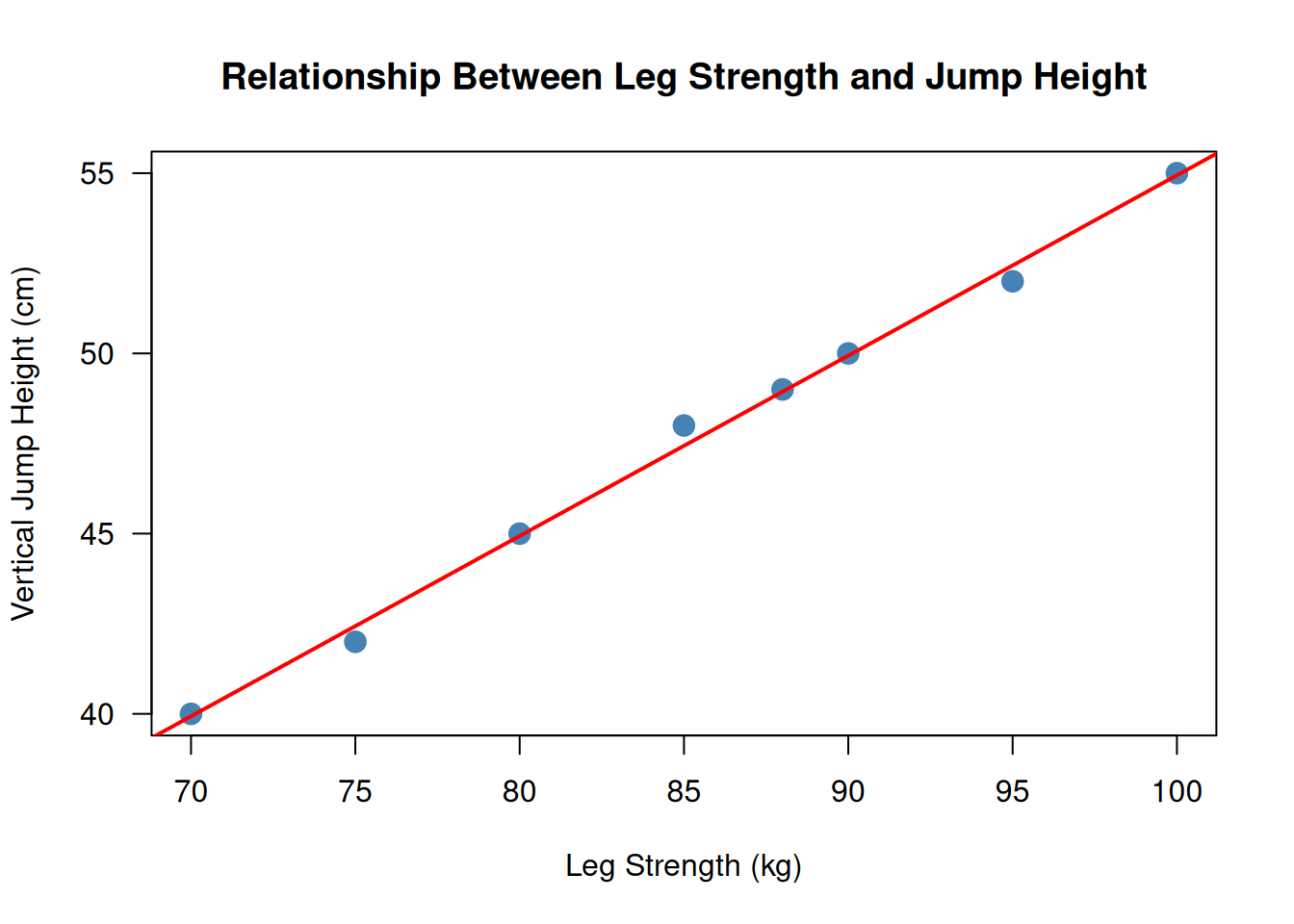
Here is an example of a scatterplot for the leg strength and jump height data:
Code
# Datastrength <-c(80, 90, 70, 100, 85, 95, 75, 88)jump <-c(45, 50, 40, 55, 48, 52, 42, 49)# Create scatterplotplot(strength, jump,main ="Relationship Between Leg Strength and Jump Height",xlab ="Leg Strength (kg)",ylab ="Vertical Jump Height (cm)",pch =19,col ="steelblue",cex =1.5,las =1)# Add a reference line (regression line)abline(lm(jump ~ strength), col ="red", lwd =2)
Figure 11.1: Scatterplot showing the strong positive linear relationship between leg strength and vertical jump height in 8 athletes.
The scatterplot in Figure 11.1 shows a clear positive linear trend, with points clustered tightly around the red regression line. This confirms the strong correlation we computed (\(r = 0.998\)).
11.6 Interpreting correlation coefficients
11.6.1 Coefficient of determination: \(r^2\)
The coefficient of determination, denoted \(r^2\), represents the proportion of variance in one variable that is explained by the other[1,7]. It is computed by squaring the correlation coefficient:
\[
r^2 = (0.998)^2 = 0.996
\]
This means that 99.6% of the variability in vertical jump height can be explained by differences in leg strength (in this sample)[4]. The remaining 0.4% is due to measurement error, individual differences in technique, or other unmeasured factors[6].
TipPractical interpretation of \(r^2\)
\(r^2 < 0.10\): Weak relationship (less than 10% shared variance)
With \(df = 6\), this \(t\)-value far exceeds any critical value, so \(p < 0.001\). We reject \(H_0\) and conclude that there is a statistically significant positive correlation between leg strength and vertical jump height[1].
A correlation can be statistically significant but practically trivial if the sample size is very large[6,8]. Always report \(r\) and \(r^2\) along with confidence intervals, not just \(p\)-values[3,12].
11.7 Bivariate linear regression
While correlation quantifies the strength of a relationship, regression models the relationship mathematically and enables prediction[1,7]. Bivariate linear regression (also called simple linear regression) fits a straight line to data:
The slope (\(b = 0.500\)) means that for every 1 kg increase in leg strength, vertical jump height increases by 0.5 cm on average[1].
The intercept (\(a = 4.938\)) is the predicted jump height when leg strength is zero—this value is not meaningful in this context (no one has zero leg strength), so the intercept should not be over-interpreted[2,7].
Making predictions
Using the regression equation, we can predict jump height for a new athlete:
The predicted vertical jump height is approximately 51 cm[1].
WarningCommon mistake: Extrapolation
Do not use the regression equation to predict values outside the range of the observed data[5,7]. For example, if the observed leg strength ranged from 70 to 100 kg, predictions for athletes with 120 kg or 50 kg leg strength would be extrapolation and may be inaccurate[1].
11.8 Assessing the fit of the regression model: \(R^2\)
In bivariate regression, the coefficient of determination (\(R^2\)) is identical to \(r^2\) (the squared correlation)[1,7]. It represents the proportion of variance in \(Y\) explained by \(X\):
\[
R^2 = r^2 = 0.996
\]
This means that 99.6% of the variability in vertical jump height is explained by the regression model using leg strength as a predictor[4,6]. The remaining 0.4% is residual variance (unexplained variability)[7].
11.8.1 Residuals and residual plots
A residual is the difference between the observed value and the predicted value:
\[
\text{residual} = y_i - \hat{y}_i
\]
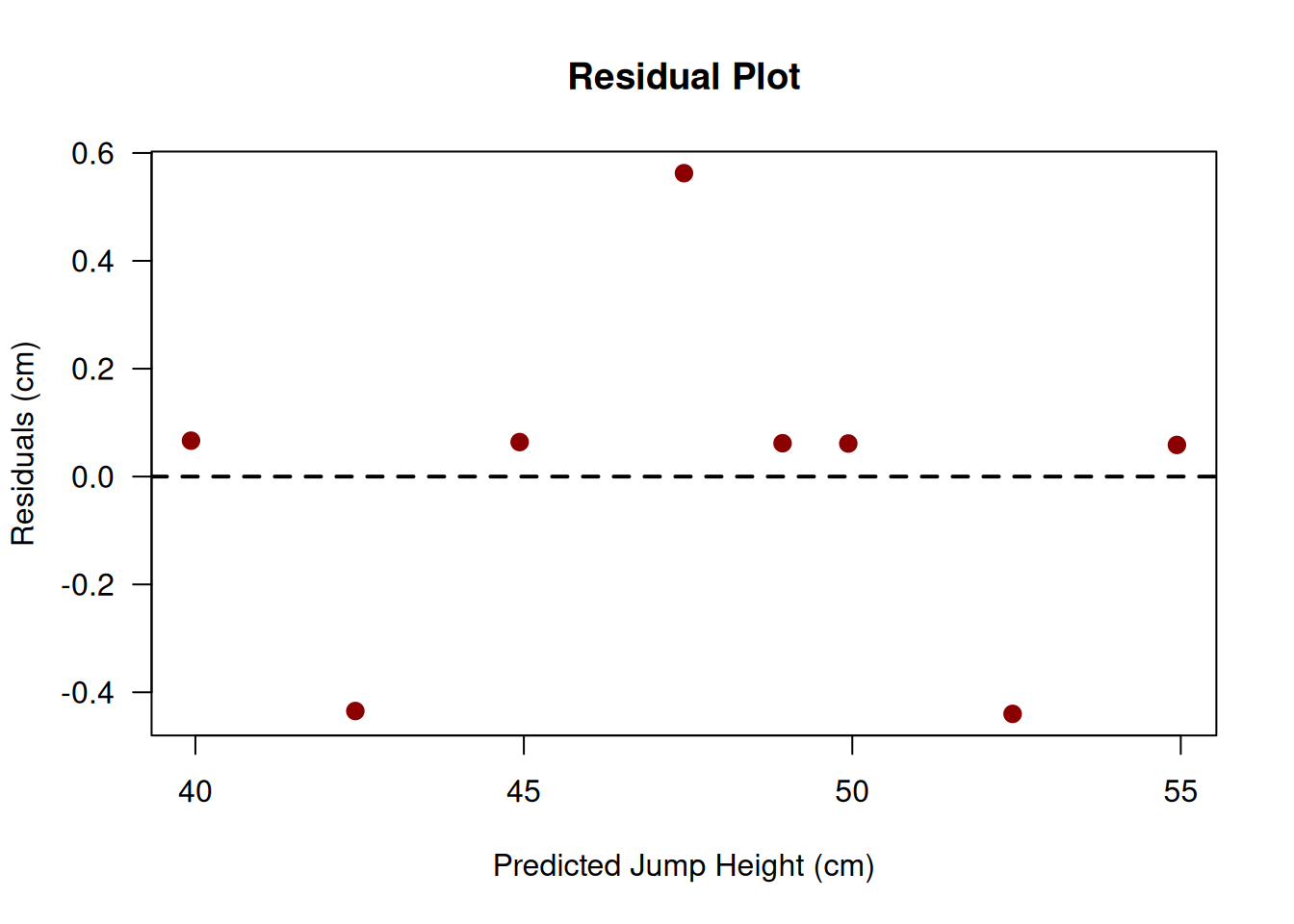
Residuals reveal how well the model fits the data[1]. Residual plots (residuals vs. predicted values) are used to check assumptions:
Linearity: Residuals should be randomly scattered around zero (no pattern)
Homoscedasticity: Residual variance should be constant across all predicted values
Normality: Residuals should be approximately normally distributed (for inference)
TipChecking assumptions with residual plots
A good residual plot looks like a random scatter of points with no pattern, no funnel shape (heteroscedasticity), and no outliers[5,7]. If you see patterns in the residuals, the linear model may be inappropriate[1].
Figure 11.2: Residual plot showing residuals versus predicted values. The random scatter with no obvious pattern suggests that the linear model is appropriate.
The residual plot in Figure [.2 shows a random scatter around zero with no obvious pattern, suggesting that the linear model is appropriate and assumptions are reasonably met[1,7].
11.9 Assumptions of correlation and regression
Both correlation and regression rely on several key assumptions[1,7]:
11.9.1 1. Linearity
The relationship between \(X\) and \(Y\) must be approximately linear[1]. Pearson’s \(r\) only measures linear relationships; nonlinear relationships (e.g., quadratic, exponential) will produce misleading correlations[5].
Check: Examine a scatterplot and residual plot[7].
11.9.2 2. Homoscedasticity
The variability in \(Y\) should be roughly constant across all values of \(X\)[1,7]. If the spread of data increases or decreases as \(X\) changes (a “funnel” pattern), this is heteroscedasticity and can distort regression results[5].
Check: Examine a scatterplot or residual plot for funnel shapes[7].
NoteReal example: Heteroscedasticity in Movement Science
[4] noted that measurement error in performance tests often increases with the magnitude of the measured value. For example, vertical jump variability may be greater in high-performers than low-performers, violating the homoscedasticity assumption. Transformations (e.g., log transformation) may help[13].
11.9.3 3. Independence
Observations must be independent[1]. In Movement Science, this means each participant should contribute one data point (or, if repeated measures are used, appropriate statistical methods must be applied)[2,7].
11.9.4 4. Normality (for inference)
For hypothesis testing and confidence intervals, the residuals (not the raw data) should be approximately normally distributed[1,7]. This assumption is less critical for large samples due to the Central Limit Theorem[3].
Check: Create a histogram or Q-Q plot of residuals[7].
11.9.5 5. No extreme outliers
Outliers can have disproportionate influence on correlation and regression[1,5]. Points with extreme \(X\) values (high leverage) and large residuals (high influence) can distort results[7].
Check: Examine scatterplots and residual plots for outliers; compute leverage and Cook’s distance[5,7].
11.10 Correlation does not imply causation
This is perhaps the most important principle in interpreting correlation and regression[1,3]. A strong correlation between \(X\) and \(Y\) does not mean that \(X\) causes \(Y\)—there are several alternative explanations:
11.10.1 1. Reverse causation
Perhaps \(Y\) causes \(X\), not the other way around[1,2].
11.10.2 2. Confounding variables
A third variable \(Z\) may cause both \(X\) and \(Y\), creating a spurious correlation[1,7].
Example: Ice cream sales and drowning deaths are positively correlated—but this does not mean ice cream causes drowning. Both are caused by warm weather (a confounding variable)[1].
11.10.3 3. Coincidence
In large datasets with many variables, some correlations will appear by chance[8,12].
ImportantEstablishing causation
To establish causation, you need more than correlation[1,7]:
Temporal precedence: The cause must precede the effect.
Covariation: The variables must be correlated.
Elimination of alternative explanations: Confounds must be ruled out through experimental control or statistical adjustment.
Randomized controlled trials (RCTs) are the gold standard for establishing causation because they control for confounding variables[3,9].
NoteReal example: Correlation vs. causation in exercise science
Observational studies show a strong negative correlation between physical activity and cardiovascular disease[2]. However, this does not necessarily mean physical activity prevents heart disease—healthier individuals may simply be more likely to exercise (reverse causation), or genetic factors may influence both activity levels and disease risk (confounding)[6]. Only randomized controlled trials can definitively establish causation[9].
11.11 Chapter summary
Correlation and regression are powerful tools for quantifying relationships between continuous variables in Movement Science[1,7]. Pearson’s correlation coefficient (\(r\)) measures the strength and direction of linear relationships, ranging from \(-1\) (perfect negative) to \(+1\) (perfect positive), with \(r^2\) representing the proportion of shared variance[3,4]. Bivariate linear regression extends correlation by fitting a mathematical model (\(\hat{y} = a + bx\)) that enables prediction, with the slope (\(b\)) indicating the change in \(Y\) per unit change in \(X\) and \(R^2\) quantifying model fit[1,6].
However, both methods require careful application and interpretation[5,7]. Always visualize data with scatterplots before computing correlations, check assumptions (linearity, homoscedasticity, independence, normality of residuals), and watch for outliers that can distort results[1,8]. Most importantly, remember that correlation does not imply causation—a strong association between two variables does not mean one causes the other, as confounding variables, reverse causation, or coincidence may explain the relationship[1,9]. Only well-designed experiments with random assignment can establish causal relationships[3,6].
Mastering correlation and regression equips you to explore relationships in Movement Science data responsibly, make predictions when appropriate, and communicate findings with appropriate caution[8,12]. These skills are foundational for understanding more advanced methods like multiple regression, ANOVA, and multivariate statistics covered in later chapters.
A correlation coefficient close to zero does not always mean there is no relationship—it means there is no linear relationship[1,5]. Two variables can have a strong nonlinear relationship (e.g., quadratic, exponential, or U-shaped) but still produce \(r \approx 0\) because Pearson’s \(r\) only measures linear associations[7]. This is why it is critical to visualize data with a scatterplot before relying on correlation coefficients[8]. For example, the relationship between exercise intensity and heart rate may be exponential rather than linear, producing a misleadingly low \(r\) if not modeled appropriately[2].
Using a regression equation to predict values outside the observed range of \(X\) is called extrapolation, and it is risky because the relationship between \(X\) and \(Y\) may not remain linear beyond the range of the data[1,7]. The regression line is only valid within the range where it was estimated—outside that range, the relationship may change direction, flatten, or become nonlinear[5]. For example, predicting oxygen consumption from heart rate might work well for moderate-intensity exercise, but at very high or very low intensities, the relationship may break down[4]. Always restrict predictions to the range of observed \(X\) values unless you have strong theoretical reasons to believe the relationship holds beyond that range[2].
In bivariate regression, \(r^2\) (the squared correlation coefficient) and \(R^2\) (the coefficient of determination) are identical—they both represent the proportion of variance in \(Y\) explained by \(X\)[1,7]. An \(R^2\) of 0.80 means that 80% of the variability in the dependent variable is accounted for by the regression model, with the remaining 20% being residual (unexplained) variance[4]. While \(r^2\) and \(R^2\) are the same in simple regression, in multiple regression (Chapter 12) \(R^2\) represents the combined explanatory power of multiple predictors[7]. A high \(R^2\) indicates a good fit, but it does not guarantee that the model is appropriate—always check residual plots to ensure assumptions are met[5,8].
Outliers—data points that are far from the general pattern—can have a disproportionate influence on correlation and regression[1,5]. A single outlier can inflate or deflate \(r\), distort the slope and intercept of the regression line, and produce misleading conclusions[7]. Points with extreme \(X\) values (high leverage) are especially influential because they pull the regression line toward themselves[5]. To address outliers, first determine whether they are legitimate data points or errors (e.g., data entry mistakes)[1]. If legitimate, consider reporting results both with and without the outlier, using robust methods (e.g., Spearman’s rank correlation), or transforming the data to reduce the outlier’s influence[5,7]. Never automatically delete outliers—they may represent important biological variability or rare but meaningful cases[4].
No—correlation does not imply causation[1,3]. While the strong positive correlation suggests that practice and performance are associated, it does not prove that practice causes improved performance[7]. Alternative explanations include: (1) reverse causation—perhaps athletes who perform better are more motivated to practice; (2) confounding variables—innate talent, coaching quality, or physical fitness may influence both practice time and performance; or (3) coincidence[1,2]. To establish causation, the researcher would need to conduct a randomized controlled trial where participants are randomly assigned to different practice schedules, thereby controlling for confounds[6,9]. Observational correlations can generate hypotheses and suggest relationships, but only experimental designs with random assignment can establish causal effects[3].
A funnel shape in a residual plot indicates heteroscedasticity—the variance of the residuals is not constant across the range of predicted values[1,7]. This violates the homoscedasticity assumption of regression, meaning that prediction accuracy varies depending on the value of \(X\)[5]. Heteroscedasticity can distort standard errors, confidence intervals, and hypothesis tests, making results unreliable[7]. Common solutions include transforming the dependent variable (e.g., using a log transformation), using weighted least squares regression, or employing robust regression methods that are less sensitive to heteroscedasticity[5,13]. In Movement Science, heteroscedasticity often occurs when measurement variability increases with the magnitude of the measured quantity[4].
1. Moore, D. S., McCabe, G. P., & Craig, B. A. (2021). Introduction to the practice of statistics (10th ed.). W. H. Freeman; Company.
2. Vincent, W. J. (1999). Statistics in kinesiology.
3. Cumming, G. (2012). Understanding the new statistics: Effect sizes, confidence intervals, and meta-analysis. Routledge.
5. Wilcox, R. R. (2017). Introduction to robust estimation and hypothesis testing (4th ed.). Academic Press.
6. Batterham, A. M., & Hopkins, W. G. (2006). Making meaningful inferences about magnitudes. International Journal of Sports Physiology and Performance, 1(1), 50–57. https://doi.org/10.1123/ijspp.1.1.50
7. Field, A. (2018). Discovering statistics using IBM SPSS statistics (5th ed.). SAGE Publications.
9. Hopkins, W. G., Marshall, S. W., Batterham, A. M., & Hanin, J. (2009). Progressive statistics for studies in sports medicine and exercise science. Medicine & Science in Sports & Exercise, 41(1), 3–13. https://doi.org/10.1249/MSS.0b013e31818cb278
10. Atkinson, G., & Nevill, A. M. (1998). Statistical methods for assessing measurement error (reliability) in variables relevant to sports medicine. Sports Medicine, 26(4), 217–238. https://doi.org/10.2165/00007256-199826040-00002
11. Matejka, J., & Fitzmaurice, G. (2017). Same stats, different graphs: Generating datasets with varied appearance and identical statistics through simulated annealing. Proceedings of the 2017 CHI Conference on Human Factors in Computing Systems, 1290–1294. https://doi.org/10.1145/3025453.3025912
12. Wilkinson, L., & Task Force on Statistical Inference. (1999). Statistical methods in psychology journals: Guidelines and explanations. American Psychologist, 54(8), 594–604. https://doi.org/10.1037/0003-066X.54.8.594