Spread, consistency, and what variability means in Movement Science
Tip💻 SPSS Tutorial Available
Learn how to calculate measures of variability in SPSS! See the SPSS Tutorial: Calculating Measures of Variability in the appendix for step-by-step instructions on using the Frequencies, Descriptives, and Explore procedures, interpreting output, creating boxplots, and reporting results in APA format.
5.1 Chapter roadmap
A measure of center tells you where values tend to fall. A measure of variability tells you how tightly values cluster around that center and how much they differ from one another. In Movement Science, variability is rarely just “messiness.” It can reflect meaningful differences among people, genuine within-person fluctuations from trial to trial, and systematic changes across practice, fatigue, or training. Movement variability is often structured and task-dependent: in some contexts, variability reflects exploration and adaptation, while in others it reflects instability or loss of control, which is why interpretation must be tied to the task and constraints rather than treated as a single “good” or “bad” quantity[1].
Variability is also inseparable from measurement. What you observe is a combination of biological variability and measurement-related variability (device resolution, rater decisions, protocol inconsistency, and environmental conditions). This matters because a spread estimate can appear “large” for either reason: participants truly vary, or the measurement process is noisy. In applied sport and movement measurement, authors often emphasize reporting and interpreting variability, with explicit attention to typical error and repeatability, rather than assuming that all spread reflects human performance alone[2,3].
This chapter builds a practical skill: describing spread in a way that matches the data and the scientific question. You will learn resistant measures (range and IQR) for quick and robust summaries, mean-based measures (variance and standard deviation) that connect naturally to later inference, relative measures (coefficient of variation) for comparing variability across outcomes with different units or magnitudes, and visual tools that make variability easy to see and hard to misinterpret[4]. Throughout, the goal is not to compute formulas in isolation. The goal is to choose a spread measure that matches the distribution, the measurement scale, and the scientific interpretation you want to defend.
By the end of this chapter, you will be able to:
Compute and interpret the range and interquartile range.
Explain variance and standard deviation, and compute them for a small dataset.
Distinguish variability in performance from measurement noise.
Use the coefficient of variation to compare relative variability across outcomes.
Choose graphs that communicate variability without misleading the reader.
5.2 Workflow used throughout Part II
Use this sequence whenever you summarize spread:
Identify the variable type and measurement scale.
Visualize the distribution (at least once).
Choose a spread measure that matches the distribution and purpose.
Pair spread with an appropriate measure of center.
Write a one-sentence justification for your choice.
5.3 Why variability matters in Movement Science
Variability is information. Two samples can share the same mean sprint time but differ dramatically in consistency. For example, two training groups might both average 3.40 s over 20 m, but one group may have nearly everyone clustered between 3.30 and 3.50 s while the other includes a mix of very fast and very slow performances. Those groups have the same center but very different spread, and that spread can matter for athlete monitoring, injury risk discussions, and how you interpret individual change.
In motor behavior, variability can reflect exploration, adaptation, fatigue, attentional demands, or a loss of control, depending on the task and context[1]. During early skill acquisition, trial-to-trial outcomes can be variable because learners are testing different movement solutions; later, variability may decrease as performance stabilizes. Under fatigue or dual-task demands, variability can increase because control is challenged. Importantly, “more variability” is not automatically bad, and “less variability” is not automatically good. The meaning depends on the task and the performer’s goals.
In measurement, variability reflects both real biological fluctuations and measurement-related sources, such as device resolution, rater decisions, and protocol inconsistencies. This is why sport and movement measurement texts emphasize typical error, repeatability, and careful protocol standardization when interpreting spread[2,3]. A sudden increase in variability could signal a true change in motor control, but it could also signal that testing conditions changed (different surface, different tester, inconsistent warm-up, different footwear).
A useful first distinction is the level at which variability lives. In Movement Science studies, variability is often nested: trials occur within a session, sessions within a person, and people within groups.
Between-person variability describes how different people are from one another at a given time point. Example: at pre-testing, participants may vary widely in peak force or VO₂, reflecting differences in fitness, body size, and training history.
Within-person variability describes how much the same person varies across repeated trials, sessions, or days. Example: within a single visit, jump height may vary across trials (trial-to-trial variability). Over the course of weeks, sprint time may vary day to day due to sleep, soreness, motivation, or minor illness (day-to-day variability).
The scientific meaning of variability depends on which level you are studying and which task you are measuring. Reviews in human movement science emphasize that variability has structure and can be linked to both healthy function and pathology, rather than being treated as pure error[1]. A practical takeaway is to always state which variability you mean (between-person or within-person), over what time scale (trials, sessions, days), and under what conditions (fatigue, learning, dual-task), because those details determine what the spread represents.
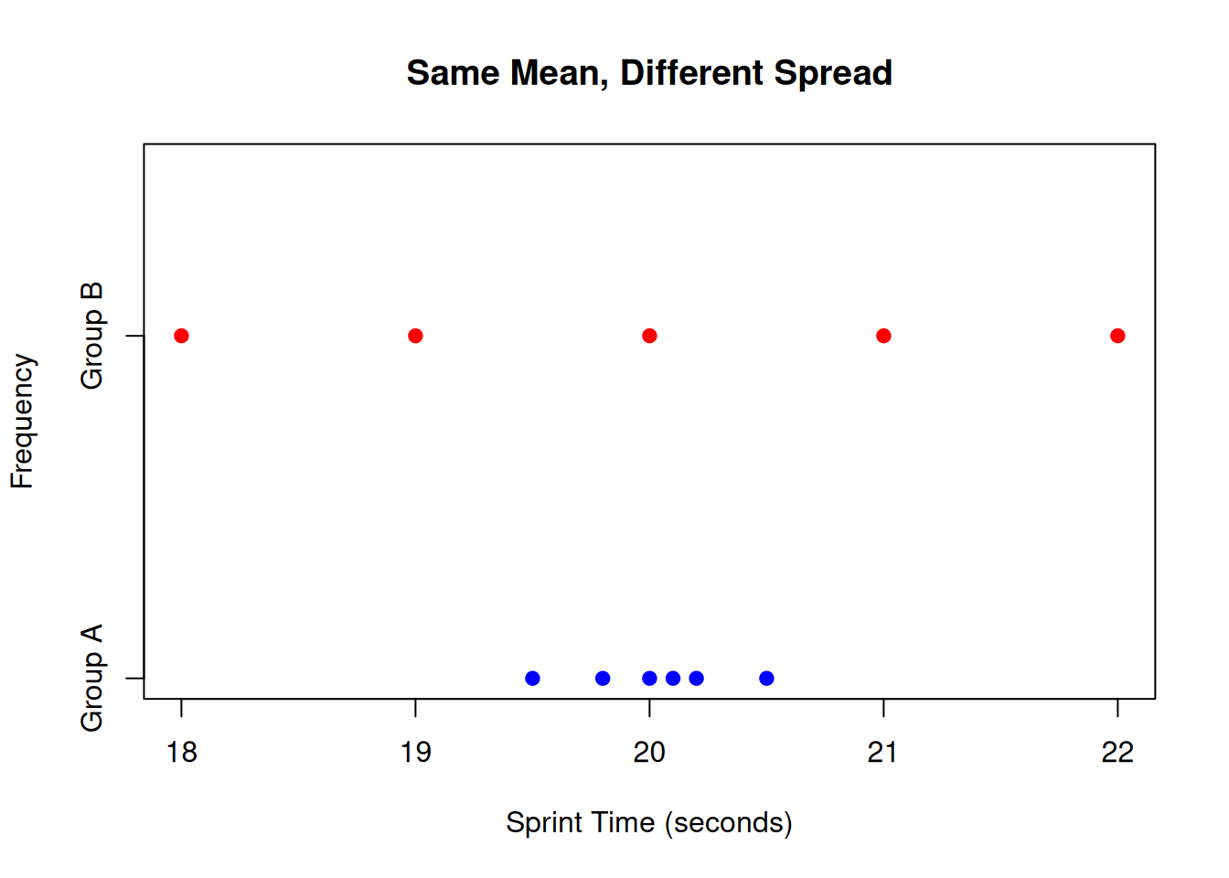
NoteReal example: same mean, different spread
Imagine two groups have the same mean sprint time of 20 m. Group A values are tightly clustered (very consistent), while Group B values are scattered (inconsistent). If you only report the mean, you miss an important performance difference: reliability of execution.
Code
# Group A: tightly clustered around 20groupA <-c(19.5, 19.8, 20.0, 20.1, 20.2, 20.5)# Group B: scattered around 20groupB <-c(18.0, 19.0, 20.0, 21.0, 22.0)# Combine dataall_data <-c(groupA, groupB)groups <-factor(c(rep("Group A", length(groupA)), rep("Group B", length(groupB))))# Create side-by-side dot plotsstripchart(all_data ~ groups, method ="stack", pch =19, col =c("blue", "red"), main ="Same Mean, Different Spread", xlab ="Sprint Time (seconds)", ylab ="Frequency")
Figure 5.1: Dot plots showing two groups with identical means but different variability
This side-by-side dot plot illustrates the critical point that identical means can mask important differences in variability. Both Group A (blue) and Group B (red) have means of approximately 20 seconds, but Group A’s times are tightly clustered (SD ≈ 0.3), indicating high consistency and reliability, while Group B’s times are widely scattered (SD ≈ 1.4), showing poor reliability despite the same average performance. In Movement Science, this distinction matters for athlete selection, training effectiveness, and interpreting whether interventions improve not just average performance but also execution consistency.
5.4 A quick visual start: variability you can see
Why start with graphs? Before computing any formula, always visualize your data. Spread measures behave differently depending on the distribution’s shape, and what looks like “normal” spread in one context might be extreme in another. Visual inspection helps you:
Detect outliers that could distort range or standard deviation
Identify skewness that makes median/IQR more appropriate than mean/SD
Spot measurement artifacts (heaping, boundaries) that affect interpretation
Choose the right spread measure for your data and question
Different plots highlight different aspects of variability. Here’s what each reveals:
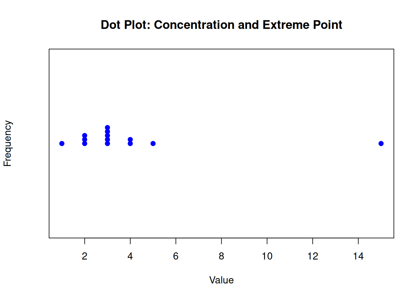
Dot plots instantly show how concentrated the values are and whether there are extreme points.
Code
# Create a dataset with concentrated values and an extreme pointdata <-c(1, 2, 2, 2, 3, 3, 3, 3, 3, 4, 4, 5, 15)# Create a dot plotstripchart(data, method ="stack", pch =19, col ="blue", main ="Dot Plot: Concentration and Extreme Point", xlab ="Value", ylab ="Frequency")
Figure 5.2: Dot plot illustrating concentration of values with an extreme outlier
This dot plot visually demonstrates the concept of variability by showing how most observations (values 1-5) are tightly clustered, indicating consistency or low spread in the central data. The extreme value at 15 stands out as an outlier, which can dramatically affect measures like the range while having minimal impact on resistant measures like the interquartile range. In Movement Science contexts, such visualizations help identify whether variability reflects true performance differences, measurement error, or unusual events like equipment malfunctions or exceptional performances.
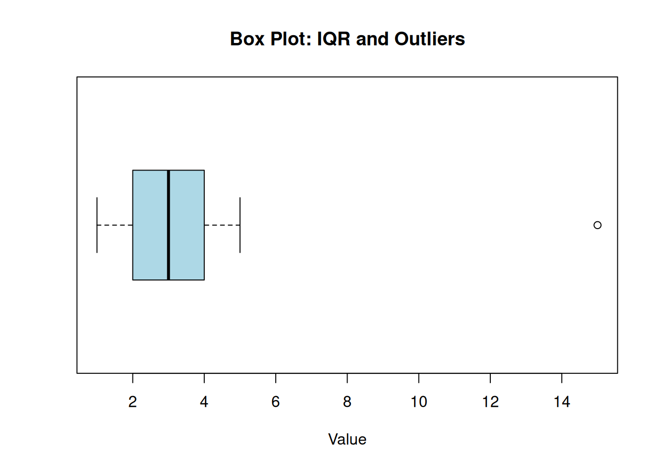
Box plots show the middle 50% (the IQR) and highlight outliers.
Code
# Create a dataset with concentrated values and an extreme pointdata <-c(1, 2, 2, 2, 3, 3, 3, 3, 3, 4, 4, 5, 15)# Create a box plotboxplot(data, horizontal =TRUE, col ="lightblue", main ="Box Plot: IQR and Outliers", xlab ="Value")
Figure 5.3: Box plot showing the interquartile range and outliers
This box plot illustrates the interquartile range (IQR) as the box spanning from the first quartile (Q1) to the third quartile (Q3), representing the middle 50% of the data. The line inside the box marks the median. The whiskers extend to show the range of non-outlier data, while the point at 15 is identified as an outlier beyond 1.5 times the IQR from the box. Unlike the range, which is influenced by this outlier, the IQR focuses on the central spread, making it more robust for skewed distributions or when outliers are present. In Movement Science, box plots help quickly assess data symmetry, central tendency, and potential anomalies that might indicate measurement issues or exceptional cases.
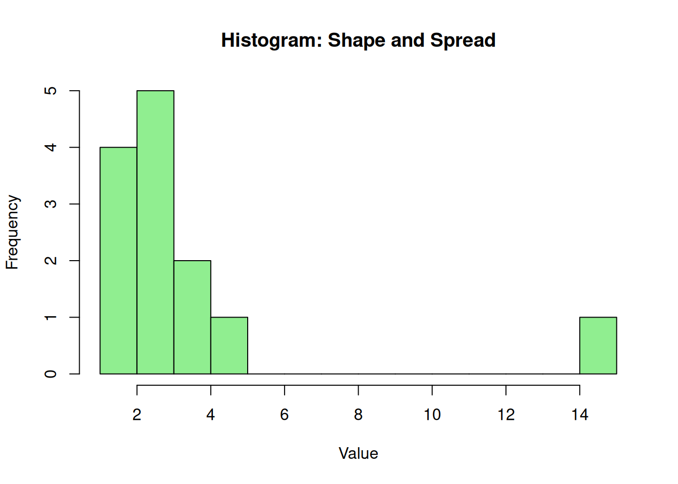
Histograms show both shape and spread, which matters because variability measures behave differently under skew.
Code
# Create a dataset with concentrated values and an extreme pointdata <-c(1, 2, 2, 2, 3, 3, 3, 3, 3, 4, 4, 5, 15)# Create a histogramhist(data, breaks =10, col ="lightgreen", main ="Histogram: Shape and Spread", xlab ="Value", ylab ="Frequency")
Figure 5.4: Histogram showing distribution shape and spread with an outlier
This histogram reveals the distribution’s shape and spread by displaying frequency counts in bins. Most values cluster around 2-4, creating a right-skewed distribution with the outlier at 15 appearing in a separate bin. The spread is evident in the width of the distribution, while the shape (right-skew) indicates that measures like the mean and standard deviation may be inflated by the outlier, whereas the median and IQR remain more representative of the central data. In Movement Science, histograms help detect skewness that could affect the choice of variability measures, ensuring appropriate statistical methods are selected for symmetric versus asymmetric data.
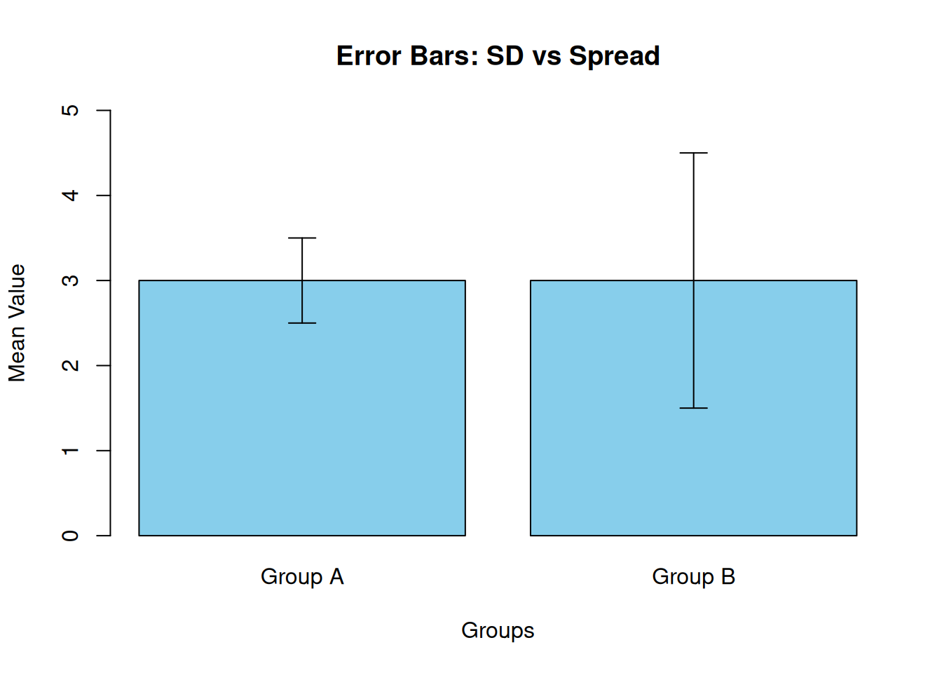
Error bars can be helpful, but they require care because different error bars answer different questions. Standard deviation bars describe the spread in the sample. Standard error or confidence interval bars describe uncertainty in the mean estimate. Confusing these can change what a reader believes the data show[4].
Code
# Sample data: two groups with same mean but different SDmeans <-c(3.0, 3.0)sds <-c(0.5, 1.5)groups <-c("Group A", "Group B")# Create bar plotbar_positions <-barplot(means, names.arg = groups, col ="skyblue", ylim =c(0, 5), main ="Error Bars: SD vs Spread", ylab ="Mean Value", xlab ="Groups")# Add error bars (SD)arrows(bar_positions, means - sds, bar_positions, means + sds, angle =90, code =3, length =0.1, col ="black")
Figure 5.5: Bar plot with standard deviation error bars showing different spreads
This bar plot with standard deviation error bars demonstrates how two groups can have identical means (3.0) but very different spreads. Group A has tight error bars (SD = 0.5), indicating consistent performance, while Group B has wide error bars (SD = 1.5), showing greater variability. These SD bars describe the actual spread in the data, not uncertainty in the mean estimate. In contrast, standard error bars would be much narrower and represent sampling variability. In Movement Science, using SD bars appropriately helps communicate performance consistency, while misusing error bars can mislead readers about data reliability or group differences.
5.5 Range and interquartile range
5.5.1 Range
The range is the simplest spread measure:
\[
\text{Range} = x_{max} - x_{min}
\]
The range tells you the distance between the smallest and largest values. It can be useful as a quick sense of extremes, especially in small samples, but it is unstable because it depends on only two observations. One unusual value can dominate it, because the range depends only on the minimum and maximum. For example, if nine sprint times fall between 3.30 and 3.50 s but one recorded time is 4.20 s (a slip or timing error), the range is driven by that single value and no longer reflects the typical spread in the group[4].
5.5.1.1 Worked example: range with 10 observations
Use this dataset of 10 observations (unsorted):
\[
12,\ 9,\ 15,\ 8,\ 10,\ 14,\ 7,\ 11,\ 13,\ 9
\]
The minimum is 7, and the maximum is 15.
\[
\text{Range} = 15 - 7 = 8
\]
Sensitivity example
If the maximum value changed from 15 to 25 (an extreme value or an error), the range would become 25 − 7 = 18. The range changed dramatically even though only one value changed.
5.5.2 Interquartile range
The interquartile range (IQR) describes the spread of the middle 50 percent of the data:
\[
\text{IQR} = Q_3 - Q_1
\]
Because it depends on quartiles (which are based on ranks), IQR is more resistant to extreme values than the range or the standard deviation. IQR is especially useful for skewed variables and for ordinal scales, and it pairs naturally with the median.
A practical note: different software packages can use slightly different conventions for quartiles, especially with small samples. The differences are usually minor, but it is good to know that quartiles are not always unique.
5.5.2.1 Worked example: IQR with 10 observations
First, sort the values:
\[
7,\ 8,\ 9,\ 9,\ 10,\ 11,\ 12,\ 13,\ 14,\ 15
\]
One common hand method is to split the ordered data into lower and upper halves.
The median of the upper half is 13, so (Q_3 = 13).
\[
\text{IQR} = 13 - 9 = 4
\]
Interpretation
The middle 50 percent of observations fall within a 4-unit span. Compared with the range (8), the IQR reflects the typical spread rather than the extremes.
WarningCommon mistake
Reporting range as if it reflects typical variability. Range often reflects outliers and extremes more than it reflects the typical participant.
5.6 Variance and standard deviation
5.6.1 Why use deviations from the mean
For many methods, we want to describe how far values tend to fall from the mean, so we start by looking at a deviation from the mean, \((x_i - \bar{x})\)[4]. A deviation tells you whether an observation is above the mean (positive deviation), below the mean (negative deviation), or exactly at the mean (zero deviation). This connects directly to the “balance point” idea: if you add all deviations from the mean, they always sum to zero because the mean is defined so that the positives and negatives cancel[4].
A small example makes the problem obvious. Suppose your mean is 10 and your observations are 8, 10, and 12. The deviations are (-2), (0), and (+2). Adding deviations gives (-2 + 0 + 2 = 0), even though the values clearly vary. The zero is not evidence of “no variability.” It is simply a consequence of the mean being a balance point.
To create a spread measure that does not cancel out, we transform the deviations before combining them. The classic approach is to square deviations, which makes every value nonnegative and gives larger departures more weight. That idea leads directly to variance (average squared deviation) and then standard deviation (the square root of variance), which returns the measure to the original units and is usually easier to interpret in applied Movement Science settings[4].
5.6.2 Sample variance
Sample variance is the average squared deviation from the mean, using (n-1) in the denominator:
\[
s^2 = \frac{\sum (x_i - \bar{x})^2}{n-1}
\]
The (n-1) reflects degrees of freedom. After you estimate the sample mean, only (n-1) deviations are free to vary independently because the deviations must sum to zero.
Important
Variance has squared units (for example, seconds squared), which makes it hard to interpret directly. For this reason, researchers typically report the standard deviation (the square root of variance) rather than variance itself, as SD is easier to understand and interpret in the original units of the data. The standard deviation fixes that by taking the square root.
5.6.3 Standard deviation
Standard deviation is:
\[
s = \sqrt{s^2}
\]
Standard deviation is interpreted as a typical distance from the mean, in the same units as the original variable. It is most interpretable when the distribution is roughly symmetric and unimodal. Under strong skew or outliers, SD can be inflated in ways that do not match the typical participant.
NoteA useful interpretation sentence
The standard deviation is a typical distance from the mean, not a boundary that most values must fall inside. To interpret SD well, you still need to look at the distribution.
5.6.3.1 Worked example: sample variance and SD with 10 observations
Use the same dataset:
\[
12,\ 9,\ 15,\ 8,\ 10,\ 14,\ 7,\ 11,\ 13,\ 9
\]
Step 1: compute the mean
\[
\bar{x} = \frac{108}{10} = 10.8
\]
Step 2: compute squared deviations and sum them
To keep the focus on interpretation, we will show the idea and the result. Each squared deviation is ((x_i - 10.8)^2). Summing all squared deviations yields:
If these values were a performance outcome (for example, seconds), the typical distance from the mean is about 2.66 units. Whether that is “large” depends on the context and the measurement scale.
WarningCommon mistake
Interpreting SD as “most values are within one SD” without checking the distribution. That rule-of-thumb only behaves well under roughly symmetric, bell-shaped distributions.
5.7 Interpreting variability in motor performance
Variability does not have a single meaning across tasks. In some contexts, reduced variability reflects consistency and skill. In other contexts, reduced variability reflects rigidity. Likewise, increased variability can reflect loss of control, but it can also reflect exploration during learning.
A helpful perspective is that healthy movement often shows an organized variability rather than zero variability. A well-known theoretical perspective in human movement science is the optimal movement variability framework, which argues that healthy, skilled movement is characterized by enough variability to remain adaptable to perturbations, but not so much variability that performance becomes unstable[1,5].
Examples that fit common Movement Science scenarios:
Balance task under fatigue: Sway variability may increase because control is challenged.
Early skill acquisition: Trial-to-trial variability may be high as learners explore different strategies, then decrease as performance stabilizes.
Strength training: Day-to-day variability may remain while the mean improves, which can be important for interpreting short-term changes.
NoteReal example: trial-to-trial variability in a jump test
Suppose the jump height is measured across three trials. If Trial 1 is consistently lower and Trials 2–3 are higher, the mean of the three trials hides a warm-up or familiarization effect. A trial-by-trial plot, along with a spread measure across the three trials, provides a more accurate picture of performance consistency.
5.8 Coefficient of variation
The coefficient of variation (CV) expresses variability relative to the mean:
\[
\text{CV} = \frac{s}{\bar{x}}\times 100%
\]
CV is especially useful when you want to compare variability across outcomes with different units or different magnitudes, and when a ratio interpretation makes sense. In sports medicine and sport science measurement contexts, expressing typical error as a CV is often recommended when measurement error scales with the magnitude of the measurement[2,3].
Cautions
CV behaves poorly when the mean is near zero, and it is usually not appropriate for ordinal scales or bounded scales where “zero” is not a true absence. In those settings, an absolute spread measure (IQR or SD) is often more interpretable.
5.8.0.1 Worked example: CV with the 10-observation dataset
A CV of 24.6 percent means the standard deviation represents about one quarter (24.6%) of the mean value. This is a relative measure that allows comparison across different scales. In Movement Science contexts:
For highly reliable, well-controlled measurements (like calibrated force platforms), CVs below 5% are typical
For field-based performance tests (like sprint times or jump heights), CVs of 3-8% are common
For more variable outcomes (like EMG amplitude or subjective ratings), CVs of 10-30% may be expected
Values above 30% often indicate measurement issues or highly heterogeneous samples
Whether 24.6% is “acceptable” depends on the measurement context, the research question, and typical error ranges reported in the literature for similar outcomes[3]. For example, in motor control studies with EMG, this level of relative variability might be reasonable given biological and measurement noise, but for precision timing tasks, it could signal inconsistent performance or measurement problems.
WarningCommon mistake
Using CV for variables where a ratio interpretation is not meaningful (for example, pain ratings) or where the mean is close to zero.
5.9 Graphical depiction of variability
Graphs often convey variability more clearly than a single number. Here are some effective options:
Boxplots: Show the IQR directly. A tall box indicates the middle 50% of values are spread out; a short box shows they are tightly clustered (Figure 5.3).
Dot plots: Display every observation, making them excellent for small and moderate samples. They clearly show clusters and outliers (Figure 5.2, Figure 5.1).
Histograms: Illustrate distribution shape and spread, which matters because variability measures behave differently under skew (Figure 5.4).
Line plots across time: Reveal whether variability changes during training. You can visualize this by adding individual trajectories or plotting the spread at each time point.
Error bars: Require careful choice of type:
Standard deviation bars describe the spread among individuals.
Standard error or confidence interval bars describe uncertainty in the mean estimate (Figure 5.5).
If the goal is to describe performance consistency, SD or IQR is usually appropriate. If the goal is to show the precision of a mean estimate, confidence intervals are usually more meaningful.
5.10 Variability as a data quality check
Variability estimates serve as important diagnostic tools for assessing data quality and measurement integrity. While variability reflects both true biological differences and measurement noise, extreme values in either direction can signal potential issues that warrant investigation[2,3].
When variability is unusually large:
Real heterogeneity: The sample may include distinct subgroups (e.g., novice vs. expert athletes, different training statuses, or age groups) that should be analyzed separately rather than combined.
Measurement inconsistency: Protocol variations across testing sessions, inconsistent warm-up procedures, different testers, or environmental factors (e.g., surface conditions, temperature) can inflate apparent variability.
Device or calibration issues: Faulty equipment, improper sensor placement, or uncalibrated instruments can introduce systematic or random error that appears as high variability.
Data entry errors: Transcription mistakes, unit conversions, or recording errors can create artificial spread in the data.
When variability is unusually small:
Constrained measurement range: The instrument may lack sufficient resolution to detect true differences, or the task may not challenge participants enough to reveal meaningful variation.
Ceiling or floor effects: In bounded scales (e.g., pain ratings from 0-10, function scores with maximum values), many observations may cluster at the upper or lower limits, artificially reducing measured variability[4].
Rounding or truncation: Values may have been rounded to whole numbers or truncated, masking true variability and potentially biasing estimates.
Overly homogeneous sample: The participants may be so similar (e.g., highly trained athletes in a narrow performance range) that natural variation is minimal, but this should be confirmed against expected population variability.
In practice, variability should be evaluated alongside the research context, expected ranges for similar measurements, and visual inspection of distributions. When extreme variability is detected, researchers should revisit their data collection protocols, check for outliers, and consider whether subgroup analyses or additional quality control measures are needed.
5.11 Worked example using the Core Dataset
This section emphasizes choosing spread measures that match the outcome. Here are recommendations for common Movement Science variables:
Sprint time: If sprint times are roughly symmetric at a time point, the mean and SD are often a reasonable pair. A dot plot can confirm whether outliers are present and whether the SD reflects typical spread.
Sway area or EMG amplitude: If sway area or EMG amplitude is right-skewed, median and IQR often describe spread more faithfully than mean and SD. If you plan to model these outcomes with mean-based methods, a log transform plus a geometric mean can be appropriate, and spread can be expressed on the log scale or as a ratio-like measure.
Pain rating or RPE: For ordinal scales, report a median with IQR and show distributions when possible. SD and CV can be hard to interpret because equal numerical steps are not guaranteed to reflect equal differences.
Function score: Because function scores can show ceiling effects, visualize first. Use summaries that reveal pile-up near the bound (median, IQR, and a plot), and be cautious when interpreting small SD values that may reflect a ceiling rather than true consistency.
5.12 Chapter summary
Measures of variability describe how spread out values are and how consistent performance appears. Range is simple but unstable and dominated by extremes. IQR focuses on the middle 50 percent and is resistant to outliers, making it a strong choice for skewed or ordinal data. Variance and standard deviation quantify typical deviation from the mean, are widely used in mean-based methods, and are most interpretable when distributions are roughly symmetric. The coefficient of variation expresses relative spread and is useful when ratio interpretations are meaningful and variability scales with magnitude. In Movement Science, variability can reflect both performance structure and measurement precision, so it should be interpreted in context and supported by graphs[1,3].
5.13 Key terms
variability; spread; range; quartiles; interquartile range; variance; standard deviation; degrees of freedom; within-person variability; between-person variability; coefficient of variation
5.14 Practice: quick checks
Group B is less consistent. Even with equal means, the larger SD indicates sprint times vary more from person to person (or from trial to trial, depending on the design). In applied settings, that difference can matter for reliability, readiness monitoring, and whether the mean difference is meaningful for individuals.
The IQR is often the most defensible first choice because it reflects the spread of the middle 50 percent of values and is resistant to extreme high observations. Pair it with the median and show a distribution plot. If you need a mean-based approach for modeling, a log transform (and geometric mean) can also be appropriate for strictly positive sway outcomes.
CV becomes unstable when the mean is close to zero and is often not meaningful when a ratio interpretation does not make sense (common with ordinal scales and many bounded scales). In those situations, an absolute spread measure (IQR or SD) plus a plot is usually more interpretable.
The outcome might be rounded heavily, constrained by a ceiling or floor, or recorded with too little resolution, so values look artificially “tight.” A plot can reveal heaping at certain values or pile-up at a boundary that makes SD small even when performance is not truly consistent.
The use of (n-1) in the sample variance formula corrects for the fact that the sample mean is estimated from the data itself, making the variance an unbiased estimator of the population variance. Dividing by n instead would produce a biased (underestimated) result.
NoteRead further
For applied perspectives on variability in movement, see reviews discussing movement variability as structured and task-dependent[1]. For applied measurement perspectives in sport science, see discussions of typical error and coefficient of variation[2,3].
TipNext chapter
The next chapter introduces the normal curve, z scores, and probability, which connect variability to standard scores and inference.
1. Stergiou, N., & Decker, L. M. (2011). Human movement variability, nonlinear dynamics, and pathology: Is there a connection? Human Movement Science, 30, 869–888. https://doi.org/10.1016/j.humov.2011.06.002
2. Atkinson, G., & Nevill, A. M. (1998). Statistical methods for assessing measurement error (reliability) in variables relevant to sports medicine. Sports Medicine, 26(4), 217–238. https://doi.org/10.2165/00007256-199826040-00002