Appendix I — Data Visualizations

Tutorial for Creating Graphs in SPSS

J Data Visualizations

NoteR Examples

The graphical examples in this appendix are created using R and ggplot2. The SPSS version of these charts will look slightly different in terms of styling, colors, and exact layout, but the core information and structure will be the same. The R examples serve as a reference for what the final visualization should communicate.

J.1 Before you make any charts

J.1.1 Open the dataset

If you are using the Core Dataset CSV files:

  • File → Open → Data…
  • Change “Files of type” to “Comma Separated Values (*.csv)”
  • Select the file (for example core_session.csv)
  • Click Open
  • In the Text Import Wizard:
    • Ensure “Delimited” is selected
    • Ensure “Comma” is selected as delimiter
    • Ensure the first row contains variable names
    • Finish

Repeat for core_trials.csv when you need trial-level plots.

J.1.2 Confirm variable types and measurement levels

You will get better default chart behavior if variables are set correctly.

  • Variable View
    • For categorical variables (example: group, time, sex_category):
      • Measure: Nominal (or Ordinal if appropriate)
      • Add Value Labels if you want readable output
    • For quantitative variables (example: sprint_20m_s, vo2_mlkgmin, peak_force_n):
      • Measure: Scale

Optional but helpful: - Data → Sort Cases… (use time and group when you want organized output) - Data → Select Cases… (if you need to filter to a single time point, like pre only)

J.2 Bar chart (counts)

Use this when the variable is categorical and you want to show how many cases fall in each category (example: number of participants in training vs control).

J.2.2 R Example

Code
# Load necessary libraries
suppressMessages(library(ggplot2))
suppressMessages(library(dplyr))

# Create sample data (replace with your actual data)
set.seed(123)
data <- data.frame(
  group = sample(c("Control", "Training"), 100, replace = TRUE)
)

# Create bar chart for counts
ggplot(data, aes(x = group)) +
  geom_bar(fill = "gray80", color = "black") +
  labs(title = "Bar Chart (Counts): Group Distribution",
       x = "Group",
       y = "Count") +
  theme_minimal()

J.3 Bar chart (percentages)

Use this when you want relative frequencies (example: percent in each group, or percent injury yes vs no).

J.3.2 R Example

Code
# Create bar chart for percentages
ggplot(data, aes(x = group)) +
  geom_bar(aes(y = after_stat(count)/sum(after_stat(count))), fill = "gray70", color = "black") +
  scale_y_continuous(labels = scales::percent) +
  labs(title = "Bar Chart (Percentages): Group Distribution",
       x = "Group",
       y = "Percentage") +
  theme_minimal()

J.4 Grouped bar chart (clustered)

Use this to compare category distributions across groups (example: sex category by group, injury status by group).

J.4.2 R Example

Code
# Create sample data with sex_category
set.seed(123)
data_clustered <- data.frame(
  group = sample(c("Control", "Training"), 200, replace = TRUE),
  sex_category = sample(c("Male", "Female"), 200, replace = TRUE)
)

# Create clustered bar chart
ggplot(data_clustered, aes(x = sex_category, fill = group)) +
  geom_bar(position = "dodge", color = "black") +
  scale_fill_manual(values = c("Control" = "gray80", "Training" = "gray50")) +
  labs(title = "Clustered Bar Chart: Sex Category by Group",
       x = "Sex Category",
       y = "Count",
       fill = "Group") +
  theme_minimal()

J.5 Histogram

Use this to understand distribution shape for a quantitative variable (example: vo2_mlkgmin, sprint_20m_s, emg_rms_uv, sway_area_cm2).

J.5.2 Option B: Legacy Dialogs (quick)

  • Graphs → Legacy Dialogs → Histogram…
  • Move the variable into “Variable”
  • Optional: Check “Display normal curve”
  • Click OK

J.5.3 R Example

Code
# Create sample quantitative data
set.seed(123)
data_hist <- data.frame(
  sprint_20m_s = rnorm(100, mean = 3.5, sd = 0.3)
)

# Create histogram with properly scaled density curve
ggplot(data_hist, aes(x = sprint_20m_s)) +
  geom_histogram(binwidth = 0.1, fill = "gray70", color = "black", alpha = 0.7) +
  geom_density(aes(y = after_stat(density) * 0.1 * 100), alpha = 0.3, fill = "gray40", color = "black") +
  labs(title = "Histogram: Sprint 20m Time",
       x = "Sprint 20m (s)",
       y = "Frequency") +
  theme_minimal()

J.6 Boxplot

Use this to compare distributions or to see outliers (example: sprint time by group, sway area by time point).

J.6.2 R Example

Code
# Create sample data for boxplot
set.seed(123)
data_box <- data.frame(
  group = sample(c("Control", "Training"), 100, replace = TRUE),
  sprint_20m_s = rnorm(100, mean = 3.5, sd = 0.3)
)

# Create boxplot
ggplot(data_box, aes(x = group, y = sprint_20m_s)) +
  geom_boxplot(fill = "gray80", color = "black") +
  labs(title = "Boxplot: Sprint 20m by Group",
       x = "Group",
       y = "Sprint 20m (s)") +
  theme_minimal()

J.7 Dot plot (show individual values)

Use this when sample sizes are small or moderate and you want to show every observation (example: sprint time by group at pre).

SPSS dot plots are available through Legacy Dialogs and through some Chart Builder templates.

J.7.2 R Example

Code
# Create dot plot
ggplot(data_box, aes(x = group, y = sprint_20m_s)) +
  geom_dotplot(binaxis = "y", stackdir = "center", fill = "gray60", color = "black", binwidth = 0.05) +
  labs(title = "Dot Plot: Sprint 20m by Group at Pre",
       x = "Group",
       y = "Sprint 20m (s)") +
  theme_minimal()

J.8 Scatterplot

Use this to visualize the relationship between two quantitative variables (example: peak_force_n vs sprint_20m_s, vo2_mlkgmin vs agility_ttest_s).

J.8.2 R Example

Code
# Create sample data for scatterplot
set.seed(123)
data_scatter <- data.frame(
  peak_force_n = rnorm(50, mean = 1000, sd = 200),
  sprint_20m_s = rnorm(50, mean = 3.5, sd = 0.3)
)

# Create scatterplot
ggplot(data_scatter, aes(x = peak_force_n, y = sprint_20m_s)) +
  geom_point(color = "black") +
  geom_smooth(method = "lm", formula = y ~ x, se = FALSE, color = "black") +
  labs(title = "Scatterplot: Peak Force vs Sprint 20m",
       x = "Peak Force (N)",
       y = "Sprint 20m (s)") +
  theme_minimal()

J.9 Scatterplot with groups (colored or separate panels)

Use this when group membership may explain clustering (example: training vs control).

J.9.1 Option A: Color by group (Chart Builder)

  • Graphs → Chart Builder…
  • Gallery: Scatter/Dot → Simple Scatter
  • Place x and y variables
  • Drag group into “Set color” (if available in your chart template)
  • Click OK

J.9.2 Option B: Panels (more reliable)

  • Graphs → Chart Builder…
  • Build the scatterplot as usual
  • Click the Groups/Point ID tab or the Panels tab (name varies by SPSS setup)
  • Add group to panel rows or columns
  • Click OK

J.9.3 R Example

Code
# Add group to scatter data
data_scatter_group <- data_scatter
data_scatter_group$group <- sample(c("Control", "Training"), 50, replace = TRUE)

# Create scatterplot with groups
ggplot(data_scatter_group, aes(x = peak_force_n, y = sprint_20m_s, color = group, shape = group)) +
  geom_point() +
  geom_smooth(method = "lm", formula = y ~ x, se = FALSE) +
  scale_color_manual(values = c("Control" = "gray60", "Training" = "black")) +
  scale_shape_manual(values = c("Control" = 16, "Training" = 17)) +
  labs(title = "Scatterplot by Group: Peak Force vs Sprint 20m",
       x = "Peak Force (N)",
       y = "Sprint 20m (s)",
       color = "Group",
       shape = "Group") +
  theme_minimal()

J.10 Line graph (group means across time)

Use this to show average change across time points (pre, mid, post) for a quantitative variable (example: mean sprint time by group across time).

J.10.2 R Example

Code
# Create sample data for line graph
set.seed(123)
data_line <- data.frame(
  time = rep(c("Pre", "Mid", "Post"), each = 60),
  group = rep(c("Control", "Training"), each = 30, times = 3),
  sprint_20m_s = c(rnorm(30, 3.6, 0.3), rnorm(30, 3.4, 0.3), rnorm(30, 3.5, 0.3),
                   rnorm(30, 3.6, 0.3), rnorm(30, 3.3, 0.3), rnorm(30, 3.2, 0.3))
)

# Calculate means
data_line_summary <- data_line %>%
  group_by(time, group) %>%
  summarise(mean_sprint = mean(sprint_20m_s), .groups = 'drop')

# Create line graph
ggplot(data_line_summary, aes(x = time, y = mean_sprint, color = group, group = group, shape = group)) +
  geom_line(linewidth = 1) +
  geom_point(size = 3) +
  scale_color_manual(values = c("Control" = "gray60", "Training" = "black")) +
  scale_shape_manual(values = c("Control" = 16, "Training" = 17)) +
  labs(title = "Line Graph: Mean Sprint 20m across Time by Group",
       x = "Time",
       y = "Mean Sprint 20m (s)",
       color = "Group",
       shape = "Group") +
  theme_minimal()

J.11 Paired line plot (pre to post within-person)

Use this to show each participant’s change across two time points (example: function score pre vs post). This is often called a paired plot or slopegraph.

SPSS can do this using Legacy Line with “Values of individual cases” after restructuring or filtering to two time points.

J.11.3 R Example

Code
# Create sample data for paired plot
set.seed(123)
data_paired <- data.frame(
  id = rep(1:20, each = 2),
  time = rep(c("Pre", "Post"), 20),
  function_0_100 = c(rnorm(20, 70, 10), rnorm(20, 75, 10))
)

# Create paired line plot
ggplot(data_paired, aes(x = time, y = function_0_100, group = id)) +
  geom_line(alpha = 0.5) +
  geom_point() +
  labs(title = "Paired Line Plot: Function Score Pre to Post",
       x = "Time",
       y = "Function Score (0-100)") +
  theme_minimal()

J.12 Spaghetti plot (individual trajectories across pre, mid, post)

Use this to show each participant’s trajectory across multiple time points.

This is most useful for moderate sample sizes or when you split by group. If you include everyone in one plot, it can become visually dense.

J.12.2 R Example

Code
# Create sample data for line graph
set.seed(123)
data_line <- data.frame(
  id = rep(1:20, each = 9),  # 20 participants, 3 time points, 3 groups? Wait, adjust
  time = rep(rep(c("Pre", "Mid", "Post"), each = 20), 3),  # Wait, better structure
  group = rep(c("Control", "Training"), each = 30),
  sprint_20m_s = rnorm(60, mean = 3.5, sd = 0.3)
)

# Actually, let's restructure properly
data_line <- expand.grid(id = 1:20, time = c("Pre", "Mid", "Post"), group = c("Control", "Training"))
data_line$sprint_20m_s <- rnorm(nrow(data_line), mean = 3.5, sd = 0.3)

# Create spaghetti plot
ggplot(data_line, aes(x = time, y = sprint_20m_s, group = id, color = group)) +
  geom_line(alpha = 0.3) +
  scale_color_manual(values = c("Control" = "gray60", "Training" = "black")) +
  labs(title = "Spaghetti Plot: Sprint 20m across Time",
       x = "Time",
       y = "Sprint 20m (s)",
       color = "Group") +
  theme_minimal()

J.13 Trial-by-trial plot (within-session pattern)

Use this to visualize patterns across trials (example: trial 1–3 jump height, peak force, sway area). This is typically done with core_trials.csv.

J.13.3 R Example

Code
# Create sample trial data
set.seed(123)
data_trial <- data.frame(
  id = rep(1:10, each = 3),
  trial = rep(1:3, 10),
  jump_height_cm = rnorm(30, mean = 40, sd = 5)
)

# Create trial-by-trial plot
ggplot(data_trial, aes(x = trial, y = jump_height_cm, group = id)) +
  geom_line(alpha = 0.5) +
  geom_point() +
  labs(title = "Trial-by-Trial Plot: Jump Height at Pre",
       x = "Trial",
       y = "Jump Height (cm)") +
  theme_minimal()

J.14 Error bars (mean with confidence interval)

Use error bars to show uncertainty in group means across conditions or time points. Use these cautiously and pair them with raw points when sample sizes are not large.

J.14.2 R Example

Code
# Create sample data for error bars
set.seed(123)
data_error <- data.frame(
  group = sample(c("Control", "Training"), 50, replace = TRUE),
  vo2_mlkgmin = rnorm(50, mean = 35, sd = 5)
)

# Calculate means and confidence intervals
data_error_summary <- data_error %>%
  group_by(group) %>%
  summarise(
    mean_vo2 = mean(vo2_mlkgmin),
    se = sd(vo2_mlkgmin) / sqrt(n()),
    ci_lower = mean_vo2 - 1.96 * se,
    ci_upper = mean_vo2 + 1.96 * se
  )

# Create error bar plot
ggplot(data_error_summary, aes(x = group, y = mean_vo2)) +
  geom_bar(stat = "identity", fill = "gray70", color = "black", alpha = 0.7) +
  geom_errorbar(aes(ymin = ci_lower, ymax = ci_upper), width = 0.2, color = "black") +
  labs(title = "Error Bars: VO2 by Group",
       x = "Group",
       y = "VO2 (mL/kg/min)") +
  theme_minimal()

J.15 Bland-Altman plot (method comparison)

Use this to assess agreement between two measurement methods (example: comparing test-retest reliability, or different assessment tools for the same outcome).

J.15.1 Built-in Method (SPSS 31 Feature)

SPSS 31 includes a dedicated Bland-Altman analysis feature:

  • Analyze → Descriptive Statistics → Bland-Altman Analysis…
  • Select your two measurement variables (example: method1_score and method2_score)
  • Choose the first variable as “Method 1” and second as “Method 2”
  • In Options:
    • Check “Confidence limits” (default 95%)
    • Optionally check “Bias correction” if needed
  • Click OK

This will automatically generate the Bland-Altman plot with:

  • Mean difference line
  • Limits of agreement (±1.96 SD)
  • Confidence intervals
  • Bias assessment statistics

J.15.2 How to Interpret Bland-Altman Plots

Bland-Altman plots assess agreement between two measurement methods by plotting the difference between methods against their average. Here’s how to interpret the key elements:

Key Reference Lines:

  • Zero line (dotted): Perfect agreement between methods
  • Mean difference line (solid): Average bias between methods
  • Limits of agreement (dashed): ±1.96 SD range containing 95% of differences

Interpretation Guidelines:

  • Good agreement: Most points fall within the limits of agreement, mean difference close to zero
  • Systematic bias: Mean difference line far from zero (one method consistently higher/lower)
  • Proportional bias: Points fan out or cluster in a pattern (agreement varies by measurement magnitude)
  • Outliers: Points outside limits of agreement indicate poor agreement for those measurements

Clinical/Practical Significance:

  • Consider both statistical agreement and whether the limits of agreement are acceptable for your application
  • For example: VO₂ max methods might tolerate ±3 mL·kg⁻¹·min⁻¹, but force measurements might need ±10 N
  • Report: “Mean bias = X (95% LoA: Y to Z)”

J.15.3 Screenshot placeholder

J.15.4 R Example

Code
# Create sample data for Bland-Altman plot (paired measurements)
set.seed(123)
n <- 50
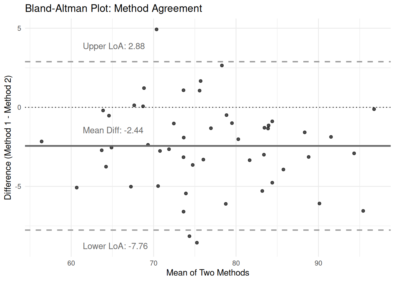
method1 <- rnorm(n, mean = 75, sd = 10)
# Method 2 has slight systematic bias (+2) and more variability
method2 <- method1 + 2 + rnorm(n, mean = 0, sd = 3)

# Calculate Bland-Altman metrics
mean_score <- (method1 + method2) / 2
difference <- method1 - method2
mean_diff <- mean(difference)
sd_diff <- sd(difference)
loa_upper <- mean_diff + 1.96 * sd_diff
loa_lower <- mean_diff - 1.96 * sd_diff

# Create Bland-Altman plot
bland_altman_data <- data.frame(mean_score, difference)

ggplot(bland_altman_data, aes(x = mean_score, y = difference)) +
  geom_point(color = "black", alpha = 0.7) +
  geom_hline(yintercept = mean_diff, color = "gray40", linetype = "solid", linewidth = 1) +
  geom_hline(yintercept = loa_upper, color = "gray60", linetype = "dashed", linewidth = 0.8) +
  geom_hline(yintercept = loa_lower, color = "gray60", linetype = "dashed", linewidth = 0.8) +
  geom_hline(yintercept = 0, color = "black", linetype = "dotted", linewidth = 0.5) +
  labs(title = "Bland-Altman Plot: Method Agreement",
       x = "Mean of Two Methods",
       y = "Difference (Method 1 - Method 2)") +
  theme_minimal() +
  annotate("text", x = min(mean_score) + 5, y = loa_upper + 1,
           label = paste("Upper LoA:", round(loa_upper, 2)), hjust = 0, color = "gray40") +
  annotate("text", x = min(mean_score) + 5, y = loa_lower - 1,
           label = paste("Lower LoA:", round(loa_lower, 2)), hjust = 0, color = "gray40") +
  annotate("text", x = min(mean_score) + 5, y = mean_diff + 1,
           label = paste("Mean Diff:", round(mean_diff, 2)), hjust = 0, color = "gray40")

J.16 Graph editing essentials in SPSS

After a chart is created, you can edit labels, scales, and formatting in the Chart Editor.

J.16.1 Open the Chart Editor

  • Double-click the chart in the Output Viewer

Common edits:

  • Add or edit titles and axis labels
  • Add units to axis labels (s, cm², N, mL·kg⁻¹·min⁻¹)
  • Adjust axis scale to improve readability
  • Change category order for ordinal variables (if needed)

J.17 Exporting charts for your book

J.17.1 Export a single chart

  • In the Output Viewer, click the chart
  • File → Export…
  • Choose a format (PNG recommended)
  • Choose a destination folder
  • Export

J.17.2 Export with consistent sizing

If you want consistent image sizes, set output options before exporting:

  • Edit → Options…
  • Look for Output or Charts settings (varies by SPSS installation)
  • Use a consistent width/height when exporting

J.18 Common mistakes to avoid

  • Using pie charts for comparisons
  • Showing mean-only bar charts without any sense of variability
  • Truncating bar chart y-axes in a way that exaggerates differences
  • Ignoring trial order when trials might show learning or fatigue
  • Treating repeated measures as independent without visual checks
TipPractical habit

For each analysis, save at least one plot that shows the raw data pattern and one plot that shows a summary. This prevents summary-only reporting from hiding important structure.