
jump_heights <- c(52, 55, 48, 60, 53, 57, 50, 61)

cat("Mean jump height:", round(mean(jump_heights), 2), "cm\n")
Mean jump height: 54.5 cmBy the end of this post, you should be able to:
Before asking whether a new training protocol improves sprint speed, or whether a new teaching method raises test scores, researchers must first describe their data clearly. Descriptive statistics are mathematical summaries that characterize the location, spread, and shape of a distribution (Field, 2018; Weir & Vincent, 2021). Without them, patterns remain invisible and errors go unnoticed.
Consider a practical example: a sport scientist studying 30-meter sprint times in youth soccer players could report pages of raw numbers, or they could report that the group averaged 4.3 s (SD = 0.4 s), with one outlier at 6.1 s who was later identified as recovering from a hamstring strain. The descriptive summary communicates far more efficiently—and flags a data quality issue that raw tables would bury.
Descriptive vs. Inferential Statistics
Descriptive statistics summarize the sample in hand. Inferential statistics use the sample to make probability-based claims about a broader population (Weir & Vincent, 2021). This post focuses exclusively on the descriptive layer—the foundation that must be solid before any inference is attempted.
The table below collects all notation used in this post for quick reference.
| Measure | Symbol |
|---|---|
| Mean (population) | \(\mu\) |
| Mean (sample) | \(\bar{x}\) |
| Median | \(Mdn\) |
| Mode | \(Mo\) |
| Range | \(R\) |
| Interquartile Range | \(IQR\) |
| Variance (population) | \(\sigma^2\) |
| Variance (sample) | \(s^2\) |
| Standard Deviation (population) | \(\sigma\) |
| Standard Deviation (sample) | \(s\) |
| Coefficient of Variation | \(CV\) |
Measures of central tendency answer one fundamental question: What is the typical value in this dataset? (Gravetter et al., 2021; Weir & Vincent, 2021). Three statistics address that question in different ways—the mean, median, and mode—each making different assumptions about the data and each sensitive to different distributional features.
The arithmetic mean (\(\bar{x}\)) is the sum of all observations divided by the number of observations (Weir & Vincent, 2021). It is the most widely used and statistically efficient estimator of the population center when data are approximately normally distributed.
\[ \bar{x} = \frac{1}{n} \sum_{i=1}^{n} x_i \]
Movement science example. Suppose we measure the vertical jump height (cm) of eight collegiate volleyball players:
\[ 52, \; 55, \; 48, \; 60, \; 53, \; 57, \; 50, \; 61 \]
\[ \bar{x} = \frac{52 + 55 + 48 + 60 + 53 + 57 + 50 + 61}{8} = \frac{436}{8} = 54.5 \text{ cm} \]
This single number tells coaches that, on average, the team clears 54.5 cm—immediately useful for program benchmarking (Hopkins, 2000).
Humanities example. In a study of reading fluency among undergraduate students, researchers might report the mean number of words read correctly per minute (WCPM). A mean of 148 WCPM with a small standard deviation suggests the group is homogeneous; a large SD points to heterogeneity that may require differentiated instruction.
Sensitivity to outliers. The mean incorporates every observation equally, so a single extreme score can distort it substantially. If the sport scientist above had accidentally entered 601 cm instead of 61 cm, the mean would jump to 118.1 cm—an absurd value that would not be caught unless the analyst also examined graphical displays (Field, 2018).
jump_heights <- c(52, 55, 48, 60, 53, 57, 50, 61)
cat("Mean jump height:", round(mean(jump_heights), 2), "cm\n")Mean jump height: 54.5 cmThe median (\(Mdn\)) is the middle value when observations are ordered from smallest to largest. For an even number of observations it is the average of the two central values (Weir & Vincent, 2021). The median is resistant to outliers because it is determined by rank position, not magnitude.
When to prefer the median. Research on athletes’ salaries routinely uses the median rather than the mean, because a handful of top-earners would inflate the mean to a level unrepresentative of the typical player. The same logic applies to any skewed physiological or performance variable—for example, injury recovery time, where most athletes recover quickly but a few require months (Field, 2018).
Movement science example. Ten cross-country runners complete a 5 km race (minutes):
\[ 18.2, \; 19.0, \; 19.5, \; 19.8, \; 20.1, \; 20.4, \; 21.0, \; 21.6, \; 22.3, \; 31.4 \]
The last value (31.4 min) belongs to a runner who fell and finished despite an ankle sprain. Ordered, the two central values are 20.1 and 20.4, giving:
\[ Mdn = \frac{20.1 + 20.4}{2} = 20.25 \text{ min} \]
The mean would be 21.3 min—inflated by the outlier. The median better represents the “typical” runner.
race_times <- c(18.2, 19.0, 19.5, 19.8, 20.1, 20.4, 21.0, 21.6, 22.3, 31.4)

writeLines(c(
  paste0("Mean race time : ",  round(mean(race_times), 2), " min"),
  paste0("Median race time: ", round(median(race_times), 2), " min"),
  paste0("Difference      : ", round(mean(race_times) - median(race_times), 2),
         " min — illustrates outlier pull on the mean")
))
Mean race time : 21.33 min
Median race time: 20.25 min
Difference : 1.08 min — illustrates outlier pull on the meanThe mode (\(Mo\)) is the most frequently occurring value in a dataset (Weir & Vincent, 2021). It is the only measure of central tendency applicable to nominal (categorical) data and is particularly informative when the researcher wants to identify the most common category or score.
Movement science example. A physical education researcher surveys 120 middle-school students about their favorite physical activity. The mode—say, basketball (reported by 38 students)—directly informs curriculum decisions. No arithmetic is possible on these nominal labels, so neither mean nor median can be computed.
Humanities example. A corpus linguist analyzing the most common words in a set of 18th-century philosophical texts finds that reason occurs more frequently than any other content word (the modal word). This frequency analysis is a form of finding the mode across word-type categories.
Data can have more than one mode. Reaction-time data from a mixed-age sample (children vs. adults) sometimes show a bimodal distribution—one peak around 250 ms (adults) and another around 400 ms (children)—revealing that the population is not homogeneous. Reporting only the mean would obscure this structure entirely (Field, 2018).
The figure below uses simulated sprint-time data to show how all three measures co-locate in a roughly normal distribution and how they diverge when one extreme score is introduced.
#| fig-cap: "Sprint times (seconds) for 50 simulated youth athletes. Left panel shows a symmetric distribution; right panel introduces a single outlier (20 s). Dashed vertical lines mark the mean (blue), median (green), and mode (red)."

set.seed(42)
n   <- 50
sym <- rnorm(n, mean = 5.8, sd = 0.35)   # symmetric

# Calculate mode for continuous data using density peak
get_mode_continuous <- function(x) {
  d <- density(x)
  d$x[which.max(d$y)]
}

skw <- c(sym, 20)  # introduce one outlier

par(mfrow = c(1, 2), mar = c(4, 4, 3, 1))

# ---- Panel A: Symmetric ----
hist(sym, breaks = 12, col = "steelblue", border = "white",
     main = "A: Symmetric", xlab = "Sprint time (s)", ylab = "Frequency", xlim = c(4.5, 7))
abline(v = mean(sym),                    col = "blue",  lwd = 2, lty = 2)
abline(v = median(sym),                  col = "darkgreen", lwd = 2, lty = 2)
abline(v = get_mode_continuous(sym),     col = "red",   lwd = 2, lty = 2)
legend("topright", legend = c("Mean", "Median", "Mode"),
       col = c("blue","darkgreen","red"), lty = 2, lwd = 2, cex = 0.8, bty = "n")

# ---- Panel B: With outlier ----
hist(skw, breaks = 15, col = "salmon", border = "white",
     main = "B: One outlier added (20 s)", xlab = "Sprint time (s)", ylab = "Frequency")
abline(v = mean(skw),                    col = "blue",  lwd = 2, lty = 2)
abline(v = median(skw),                  col = "darkgreen", lwd = 2, lty = 2)
abline(v = get_mode_continuous(sym),     col = "red",   lwd = 2, lty = 2)
legend("topright", legend = c("Mean", "Median", "Mode"),
       col = c("blue","darkgreen","red"), lty = 2, lwd = 2, cex = 0.8, bty = "n")

par(mfrow = c(1,1))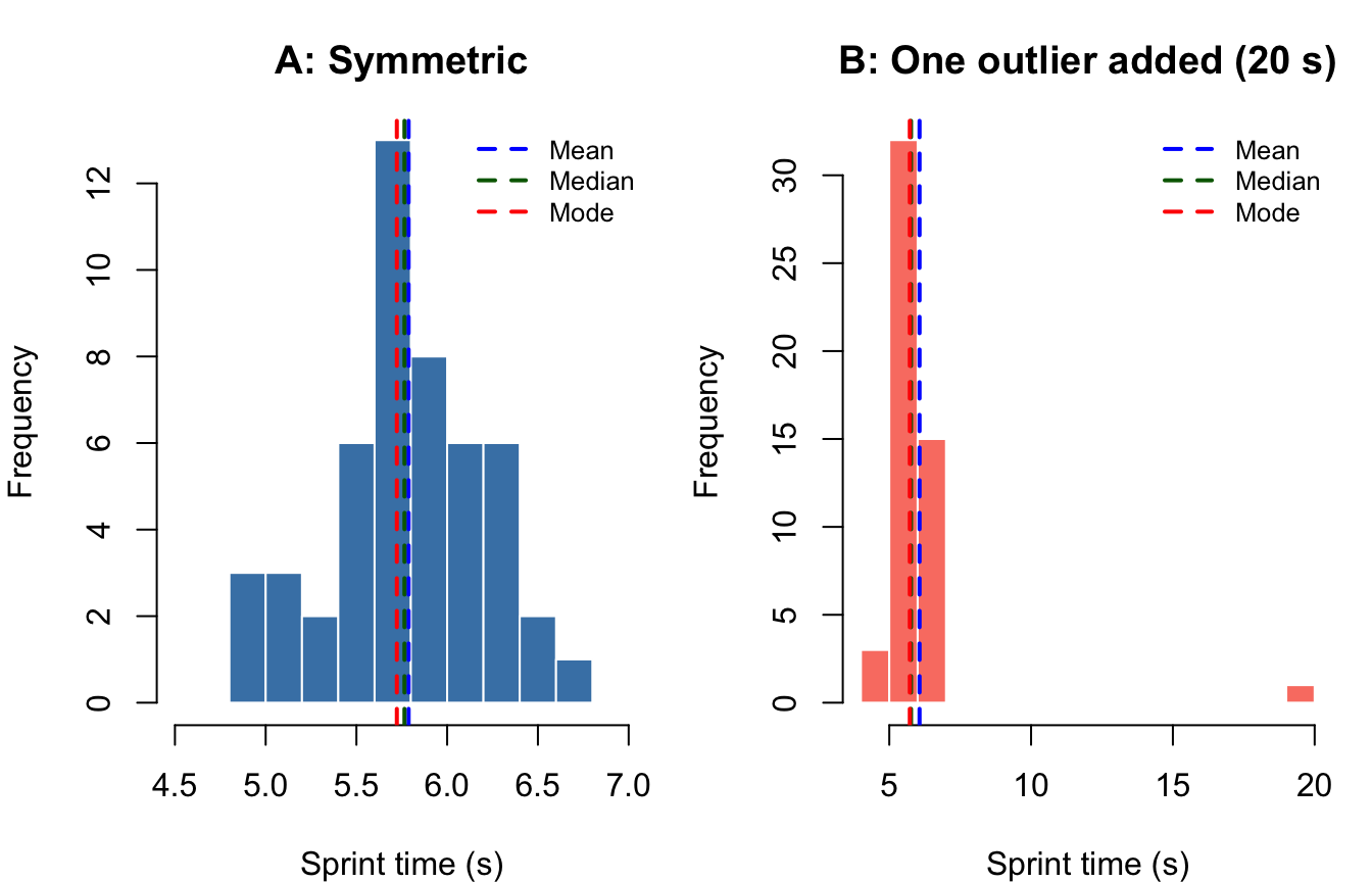
Interpretation: In the symmetric distribution (Panel A), all three measures nearly coincide—a hallmark of normality. In Panel B, the outlier pulls the mean rightward while the median and mode remain stable, demonstrating the mean’s vulnerability to extreme values (Gravetter et al., 2021).
| Measure | Best used when… | Sensitive to outliers? | Works with nominal data? |
|---|---|---|---|
| Mean | Data are continuous, roughly symmetric | Yes | No |
| Median | Data are skewed or contain outliers | No | No |
| Mode | Data are categorical, or you need the most frequent value | No | Yes |
Reporting only a measure of central tendency is insufficient and can be misleading (Thomas et al., 2015; Weir & Vincent, 2021). Two groups can share an identical mean yet differ dramatically in their spread. For instance, two groups of runners both averaging 10.5 s in the 100-m dash might have standard deviations of 0.2 s (a homogeneous, elite group) versus 1.8 s (a heterogeneous recreational group)—a distinction with profound practical implications for training design.
Measures of variability quantify how spread out observations are around the center of a distribution. Four primary measures are used in kinesiology and behavioral research: range, interquartile range, variance, and standard deviation (Weir & Vincent, 2021). A fifth—the coefficient of variation—extends the concept to relative comparisons across different scales.
The range is the distance between the maximum and minimum values:
\[ R = X_{max} - X_{min} \]
It requires only two data points to compute and is easily understood. However, it is maximally sensitive to outliers: a single extreme observation can inflate the range irrespective of what the remaining data look like (Weir & Vincent, 2021).
Movement science example. Grip strength (kg) for 12 collegiate wrestlers:
\[ 45, \; 48, \; 50, \; 52, \; 53, \; 54, \; 55, \; 56, \; 58, \; 60, \; 62, \; 89 \]
\[ R = 89 - 45 = 44 \text{ kg} \]
The value 89 kg belongs to the team’s nationally ranked heavyweight; without it, \(R = 62 - 45 = 17\) kg. Reporting only the range would overstate within-team variability for the 11 remaining athletes.
Practical guideline. Report the range alongside the mean or median as a quick data-quality check, but do not rely on it as the sole variability descriptor (Field, 2018).
The interquartile range (IQR) is the spread of the middle 50% of the distribution:
\[ IQR = Q_3 - Q_1 \]
where \(Q_1\) is the 25th percentile and \(Q_3\) is the 75th percentile. Because IQR excludes the upper and lower 25% of data, it is robust against outliers and is the natural companion to the median (Field, 2018; Weir & Vincent, 2021).
Movement science example. Hip flexor flexibility (°) measured in 20 collegiate dancers (sorted):
\[ 72, 75, 78, 80, 82, 84, 85, 87, 88, 90, 91, 92, 94, 95, 96, 98, 100, 103, 108, 140 \]
flexibility <- c(72, 75, 78, 80, 82, 84, 85, 87, 88, 90,
                 91, 92, 94, 95, 96, 98, 100, 103, 108, 140)

q <- quantile(flexibility, probs = c(0.25, 0.75))
writeLines(c(
  paste0("Q1  = ", q[1], " degrees"),
  paste0("Q3  = ", q[2], " degrees"),
  paste0("IQR = ", q[2] - q[1], " degrees")
))
Q1 = 83.5 degrees
Q3 = 96.5 degrees
IQR = 13 degreesThe IQR of 13° excludes the extreme value of 140° (likely a hyperflexible individual), giving a more representative picture of the group.
Boxplot — the IQR made visible. The boxplot is the standard graphical display for IQR-based summaries. The box spans \(Q_1\) to \(Q_3\); the horizontal line inside marks the median; whiskers extend to the most extreme non-outlier values; points beyond the whiskers are plotted individually as potential outliers (Field, 2018).
#| fig-cap: "Boxplot of hip flexor flexibility scores (degrees) in 20 collegiate dancers. The box spans the IQR (Q1–Q3), the center line marks the median, and the filled circle identifies the outlier (140°)."

boxplot(flexibility,
        horizontal = TRUE,
        col = "lightblue",
        border = "navy",
        main = "Hip Flexor Flexibility — Collegiate Dancers",
        xlab = "Flexibility (degrees)",
        pch  = 19,
        outcol = "red")
text(quantile(flexibility, 0.25), 1.3,
     paste0("Q1 = ", quantile(flexibility, 0.25)), cex = 0.8, col = "navy")
text(quantile(flexibility, 0.75), 1.3,
     paste0("Q3 = ", quantile(flexibility, 0.75)), cex = 0.8, col = "navy")
text(median(flexibility), 0.7,
     paste0("Mdn = ", median(flexibility)), cex = 0.8, col = "darkgreen")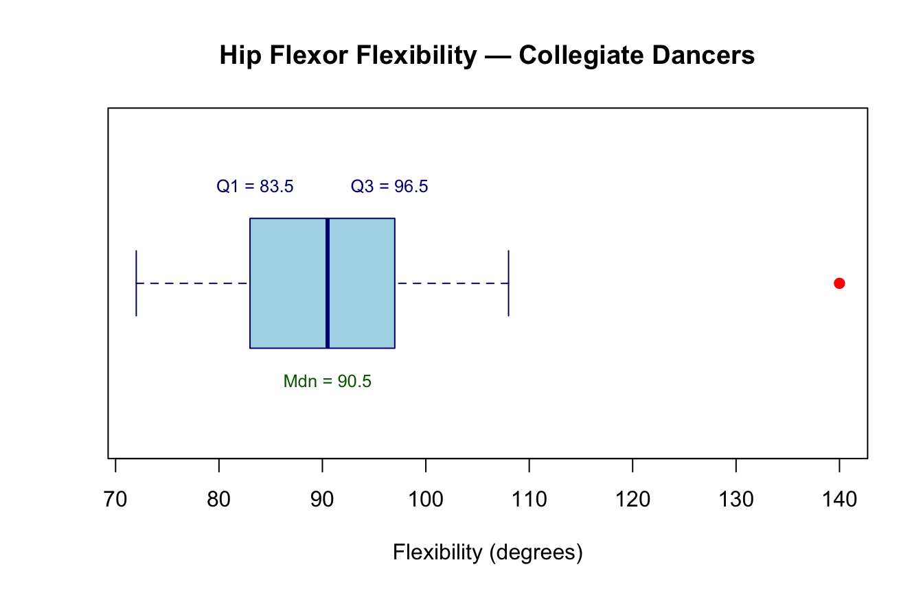
The sample variance (\(s^2\)) is the average squared deviation from the mean:
\[ s^2 = \frac{\sum_{i=1}^{n}(x_i - \bar{x})^2}{n - 1} \]
The denominator uses \(n - 1\) (rather than \(n\)) to produce an unbiased estimate of the population variance—a property known as Bessel’s correction (Gravetter et al., 2021).
Movement science example. Reaction times (ms) for five sprinters at the starting blocks:
\[ 141, \; 150, \; 155, \; 132, \; 145 \]
rt <- c(141, 150, 155, 132, 145)
xbar <- mean(rt)
n    <- length(rt)
deviations_sq <- (rt - xbar)^2

writeLines(c(
  paste0("Mean reaction time: ", xbar, " ms"),
  paste0("Squared deviations: ", paste(round(deviations_sq, 2), collapse = "  ")),
  paste0("Sum of sq. dev.   : ", round(sum(deviations_sq), 2)),
  paste0("Variance (s²)     : ", round(var(rt), 2), " ms²")
))
Mean reaction time: 144.6 ms
Squared deviations: 12.96 29.16 108.16 158.76 0.16
Sum of sq. dev. : 309.2
Variance (s²) : 77.3 ms²Why squared units? Squaring the deviations removes negative signs and penalizes large deviations more heavily than small ones. However, the result is expressed in squared units (ms²), which are difficult to interpret directly. This motivates the standard deviation, which restores the original measurement scale.
The standard deviation (\(s\)) is the square root of the variance:
\[ s = \sqrt{\frac{\sum_{i=1}^{n}(x_i - \bar{x})^2}{n-1}} \]
It is the most commonly reported variability statistic in kinesiology research because it shares units with the original measurement, making it directly interpretable (Hopkins, 2000; Weir & Vincent, 2021).
A useful rule of thumb (Normal distribution). For roughly normal data:
This “68–95–99.7 rule” helps researchers quickly identify unusual values and assess normality (Gravetter et al., 2021).
Movement science example (continued). From the reaction-time data above:
writeLines(c(
  paste0("Standard deviation (s): ", round(sd(rt), 2), " ms"),
  paste0("68% CI (approx.): ", round(mean(rt) - sd(rt), 1),
         " to ", round(mean(rt) + sd(rt), 1), " ms")
))
Standard deviation (s): 8.79 ms
68% CI (approx.): 135.8 to 153.4 msHumanities example. A historian records the publication lag (years from manuscript completion to print) for 40 major philosophical treatises from the Enlightenment era. A mean of 3.2 years with \(s = 0.8\) years indicates relatively consistent publication timelines; \(s = 5.6\) years would signal high variability potentially attributable to political censorship or patronage networks—a substantively interesting finding.
#| fig-cap: "Reaction times (ms) for five sprinters at the starting blocks. The dashed line marks the group mean; shaded band shows ±1 SD. Individual data points are displayed as filled circles."

rt_data <- data.frame(athlete = factor(1:5), rt = c(141, 150, 155, 132, 145))
xm <- mean(rt_data$rt)
xs <- sd(rt_data$rt)

plot(rt_data$athlete, rt_data$rt,
     pch = 19, col = "steelblue", cex = 1.5,
     ylim = c(115, 175),
     xlab = "Athlete", ylab = "Reaction Time (ms)",
     main = "Sprinter Reaction Times: Mean ± 1 SD")
abline(h = xm, lty = 2, col = "navy", lwd = 2)
rect(0.5, xm - xs, 5.5, xm + xs, col = rgb(0, 0, 1, 0.08), border = NA)
text(5.3, xm + 2, expression(bar(x)), col = "navy", cex = 0.9)
text(5.3, xm + xs + 2, "+1 SD", col = "steelblue", cex = 0.8)
text(5.3, xm - xs - 2, "-1 SD", col = "steelblue", cex = 0.8)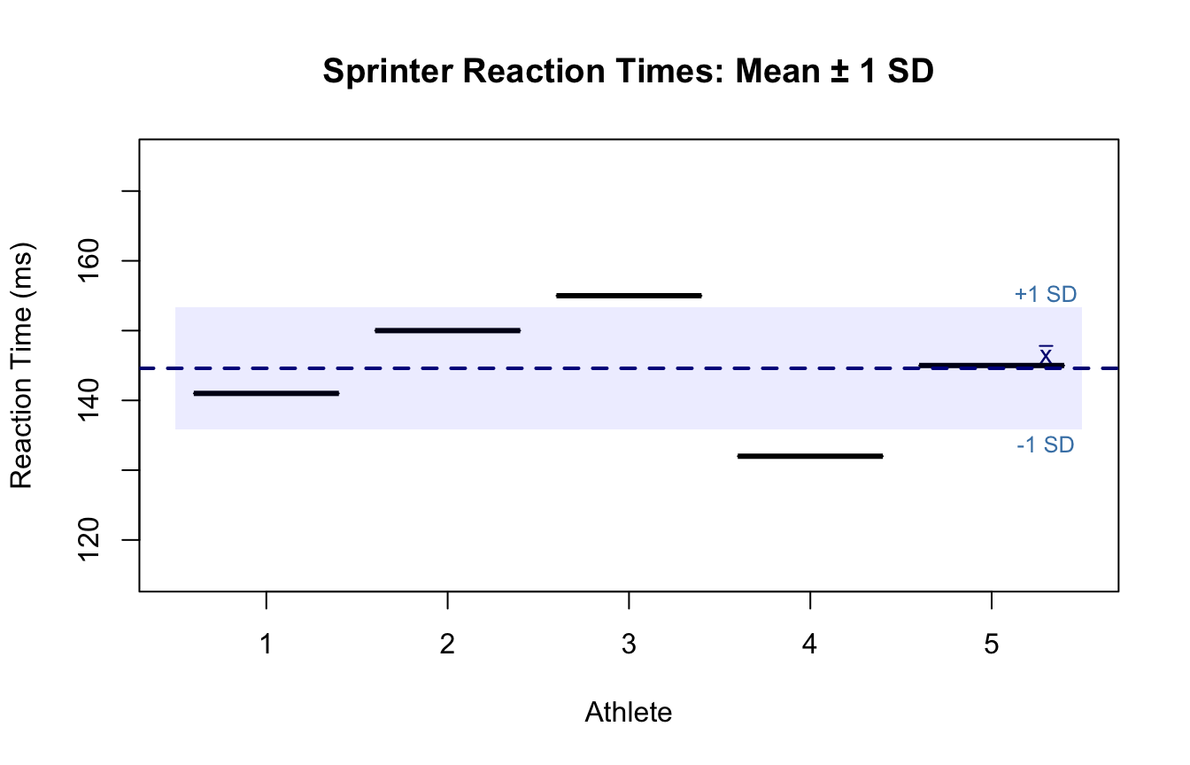
The coefficient of variation (CV) expresses the standard deviation as a percentage of the mean:
\[ CV = \frac{s}{\bar{x}} \times 100\% \]
Because it is dimensionless, the CV is uniquely suited for comparing the relative variability of measurements recorded on different scales or units (Atkinson & Nevill, 1998; Hopkins, 2000; Weir & Vincent, 2021).
Movement science example. A strength and conditioning researcher wants to compare the consistency of two performance tests: vertical jump height (cm) and isokinetic knee extension torque (N·m).
# Vertical jump (cm)
jump <- c(52, 55, 48, 60, 53, 57, 50, 61, 54, 56)
# Isokinetic torque (N·m)
torque <- c(180, 210, 175, 230, 195, 220, 185, 215, 200, 190)

cv <- function(x) round(sd(x) / mean(x) * 100, 1)

results <- data.frame(
  Test           = c("Vertical Jump (cm)", "Isokinetic Torque (N·m)"),
  Mean           = c(round(mean(jump), 1), round(mean(torque), 1)),
  SD             = c(round(sd(jump), 1), round(sd(torque), 1)),
  CV_pct         = c(cv(jump), cv(torque))
)
names(results)[4] <- "CV (%)"
print(results, row.names = FALSE)
Test Mean SD CV (%)
Vertical Jump (cm) 54.6 4.1 7.5
Isokinetic Torque (N·m) 200.0 18.3 9.1Even though the torque measure has a much larger SD in absolute terms, the CV reveals that the two tests have similar relative variability. This prevents the erroneous conclusion that torque is “more variable.”
Hopkins (2000) suggests that a CV below 5% is typically considered good test-retest reliability for laboratory performance tests in sports science, while CVs between 5–15% are acceptable, and values above 15% indicate poor reliability or substantial biological variability (Hopkins, 2000).
#| fig-cap: "Coefficient of variation (%) for four common kinesiology performance tests. The dashed line at 10% marks a frequently used threshold separating low from moderate variability."

tests <- c("Vertical Jump", "Grip Strength", "VO2max", "Reaction Time")
cvs   <- c(cv(jump), 8.2, 6.5, 12.3)

barplot(cvs,
        names.arg = tests,
        col = ifelse(cvs < 10, "steelblue", "salmon"),
        border = "white",
        ylab = "Coefficient of Variation (%)",
        main = "Relative Variability Across Performance Tests",
        ylim = c(0, 16),
        las = 1,
        cex.names = 0.85)
abline(h = 10, lty = 2, col = "red", lwd = 1.5)
text(4.8, 10.5, "10% threshold", col = "red", cex = 0.8)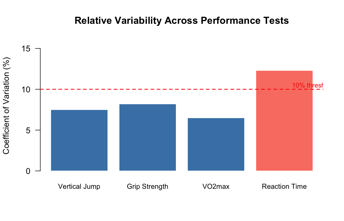
| Measure | Formula | Units | Sensitive to outliers? | Best use |
|---|---|---|---|---|
| Range | \(X_{max} - X_{min}\) | Same as data | Very sensitive | Quick screen; data entry check |
| IQR | \(Q_3 - Q_1\) | Same as data | Resistant | Skewed data; companion to median |
| Variance | \(\frac{\sum(x_i - \bar{x})^2}{n-1}\) | Squared units | Moderate | Mathematical derivations; ANOVA |
| SD | \(\sqrt{s^2}\) | Same as data | Moderate | Normal data; reporting with mean |
| CV | \(\frac{s}{\bar{x}} \times 100\%\) | Dimensionless (%) | Moderate | Comparing across different scales |
Suppose we collect resting heart rate (bpm) for 15 physical education students:
\[ 62, 68, 70, 72, 64, 75, 71, 69, 66, 73, 70, 68, 74, 65, 98 \]
The value 98 bpm belongs to a student who reported high caffeine consumption that morning.
hr <- c(62, 68, 70, 72, 64, 75, 71, 69, 66, 73, 70, 68, 74, 65, 98)

writeLines(c(
  paste0("n             = ", length(hr)),
  paste0("Mean          = ", round(mean(hr), 2), " bpm"),
  paste0("Median        = ", median(hr), " bpm"),
  paste0("SD            = ", round(sd(hr), 2), " bpm"),
  paste0("Variance      = ", round(var(hr), 2), " bpm\u00b2"),
  paste0("Range         = ", diff(range(hr)), " bpm"),
  paste0("IQR           = ", IQR(hr), " bpm"),
  paste0("CV            = ", round(sd(hr)/mean(hr)*100, 1), "%")
))
n = 15
Mean = 71 bpm
Median = 70 bpm
SD = 8.34 bpm
Variance = 69.57 bpm²
Range = 36 bpm
IQR = 5.5 bpm
CV = 11.7%#| fig-cap: "Resting heart rate (bpm) for 15 physical education students. The histogram (left) shows a right-skewed distribution caused by the outlier; the boxplot (right) clearly identifies the outlier as a value beyond 1.5×IQR from Q3."
par(mfrow = c(1, 2), mar = c(4.5, 4, 3, 1))
hist(hr, breaks = 10, col = "lightblue", border = "white",
main = "Histogram", xlab = "Resting Heart Rate (bpm)")
abline(v = mean(hr), col = "blue", lwd = 2, lty = 2)
abline(v = median(hr), col = "darkgreen", lwd = 2, lty = 2)
legend("topright", legend = c("Mean", "Median"),
col = c("blue","darkgreen"), lty = 2, lwd = 2, cex = 0.75, bty = "n")
boxplot(hr, col = "lightblue", border = "navy",
main = "Boxplot", ylab = "Resting Heart Rate (bpm)",
pch = 19, outcol = "red", outcex = 1.2)
par(mfrow = c(1, 1))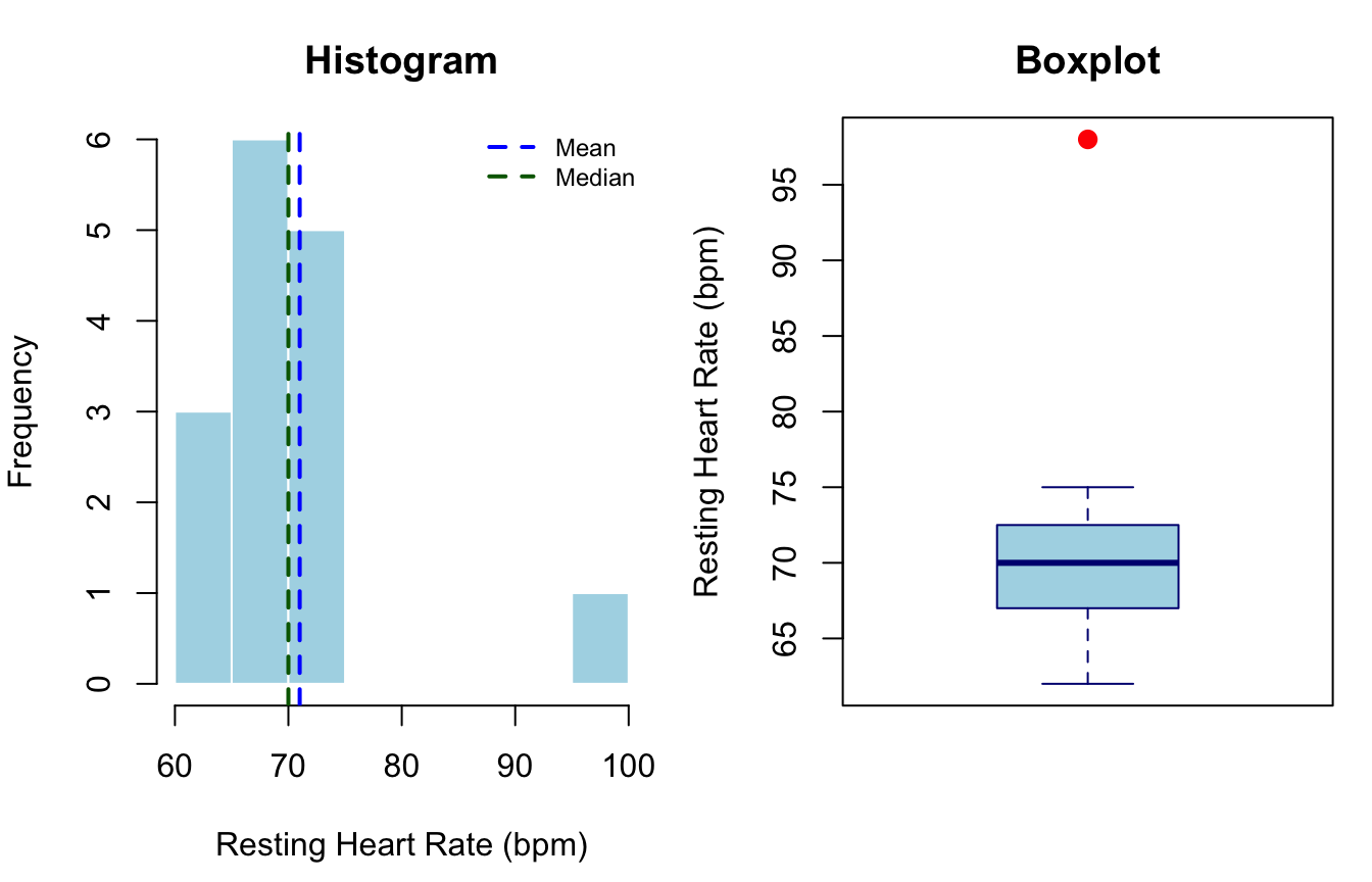
Key takeaway: The mean (72.3 bpm) is pulled upward by the outlier; the median (70 bpm) is unaffected. The boxplot flags the outlier immediately. A researcher who reports only the mean without a boxplot or histogram would not detect this anomaly (Field, 2018).
Descriptive statistics describe the sample—they do not support causal claims or generalizations to other populations (Thomas et al., 2015). Additionally, no single statistic should be reported in isolation:
APA reporting style. The APA Publication Manual (7th ed.) recommends reporting means and standard deviations in the text as \(M = 70.0\), \(SD = 8.5\), or in a summary table. For non-normal distributions, accompany the median and IQR: \(Mdn = 70\), \(IQR = 7\).
Descriptive statistics are the essential first layer of any quantitative analysis. The key concepts covered in this post are:
These building blocks underpin every subsequent inferential procedure. A well-characterized, carefully visualized dataset is the strongest foundation for valid statistical inference.
@misc{furtado2026,
  author = {Furtado, Ovande},
  title = {Descriptive {Statistics}},
  date = {2026-03-04},
  url = {https://drfurtado.github.io/randomstats/posts/02162023-descriptive-statistics/},
  langid = {en}
}