Displaying data effectively is important in order to communicate information clearly and accurately, and there are many different types of data displays, such as bar charts, line graphs, and scatter plots, that can be used for this purpose.
Here are some possible learning objectives for a lesson on displaying data:
Understand the importance of displaying data effectively in order to communicate information clearly and accurately.
Know the characteristics of different types of data displays, such as bar charts, line graphs, and scatter plots, and be able to select the appropriate type of display for a given set of data.
Know how to create and customize data displays using a variety of tools and software, such as Excel, SPSS, jamovi, and R.
Know best practices for designing data displays, including selecting an appropriate scale, labeling axes and data points, and using appropriate chart titles and legends.
Be able to interpret and analyze data displays in order to draw conclusions and make informed decisions.
Introduction
Displaying data effectively?
Displaying data effectively is important because it helps to clearly communicate information and findings to others. A well-designed data display can make it easier to understand complex or large amounts of data, and can highlight key trends and patterns.
Effective data displays can also be more visually appealing and engaging, which can help to hold the attention of an audience and make the information more memorable. In addition, using clear and accurate data displays can help to build trust and credibility with your audience.
Displaying data effectively is important because it helps to clearly communicate information and findings to others.
Types of data displays?
Some common types of data displays include:
Bar chart: A bar chart is a graphical display of data using bars of different heights. It is often used to compare different categories of data.
Line graph: A line graph is a graphical display of data that shows how a value changes over time. It can be used to show trends and patterns in data.
Scatter plot: A scatter plot is a graphical display of data that uses dots to represent individual data points. It can be used to show the relationship between two variables.
Histogram: A histogram is a graphical display of data that shows the frequency or occurrence of different values within a dataset. It is similar to a bar chart, but the bars are typically shown as adjacent rather than separated.
Box plots: used to show the distribution and quartiles of numerical data
Choosing the right type of data display
When to use a bar chart
A bar chart is a graphical display of data using bars of different heights. It is often used to compare different categories of data.
Bar charts can be a useful data display option in kinesiology, or the study of human movement, in a number of situations. Some examples of when you might use a bar chart in kinesiology include:
Comparing the muscle strength or endurance of different groups of people, such as men and women, or people of different ages.
Comparing the results of different tests or measurements, such as the time it takes to complete a certain task or the distance covered during a movement.
Showing changes in muscle strength or performance over time, such as the results of a strength training program.
In general, bar charts are a good choice when you want to compare different groups or categories, or when you want to show how a variable changes over time. They can be particularly useful when you have relatively few data points, as they can help to clearly and simply represent the data.
Bar charts in Excel
To create a bar chart in Excel:
Open a new worksheet in Excel.
Enter the data that you want to include in the chart in the worksheet. Each row of data should be a separate category, and each column should contain a different data series.
Select the data that you want to include in the chart. This should include the labels for the categories and the data for each series.
Click the “Insert” tab in the ribbon at the top of the screen.
In the “Charts” group, click the “Insert Column or Bar Chart” button.
Select the type of bar chart that you want to create (e.g. Clustered Bar, Stacked Bar, 100% Stacked Bar).
The chart will be inserted into the worksheet. You can move and resize the chart as needed.
To customize the chart, right-click on the chart and select “Format Chart Area” from the context menu. This will open the Format Chart Area pane on the right side of the screen, where you can modify the appearance and layout of the chart.
To add or edit the data in the chart, click on the chart to activate it, then click on the data series or labels that you want to edit. You can also use the “Select Data” option in the “Data” group on the “Chart Tools” tab to edit the data and labels in the chart.
Bar charts in SPSS
To create a bar chart in SPSS:
Open a new SPSS data file or open an existing data file that contains the data you want to use for the chart.
Click on the “Graphs” tab in the main SPSS window.
In the “Charts” group, click the “Chart Builder” button.
In the “Chart Builder” window, select the type of bar chart that you want to create (e.g. Bar, Clustered Bar, Stacked Bar, 100% Stacked Bar).
In the “Variables” box on the left side of the window, select the variables that you want to include in the chart. These will be the categories for the chart.
In the “Chart Preview” box on the right side of the window, you can see a preview of the chart as you build it. You can use the options in the “Chart Properties” and “Element Properties” boxes to customize the appearance and layout of the chart.
When you are satisfied with the chart, click the “OK” button to insert the chart into the output window.
To edit the data in the chart, click on the chart to activate it, then click the “Edit Data” button in the “Chart Tools” tab. This will open the “Edit Data” window, where you can modify the data and labels in the chart.
To save the chart, click the “Export” button in the “Chart Tools” tab, then select the “Save As” option and choose a location to save the chart. You can choose to save the chart as an image file (e.g. JPG, PNG) or as a SPSS chart template.
Bar charts in jamovi
To create a bar chart in jamovi:
Open a new jamovi data file or open an existing data file that contains the data you want to use for the chart.
Click on “Analyses”, then “Descriptives”.
Move a continuous variable under “Variables” and a categorical variables under “Split by”
Click on “Plots” and choose “Bar plot”. The graph will display in the output frame.
Currently, jamovi does not allow you to edit the x and y axis labels. The workaround is to change the names of the variables in “Data”.
In the “Bar Charts” group, click the “Bar Chart” button.
Bar charts in R
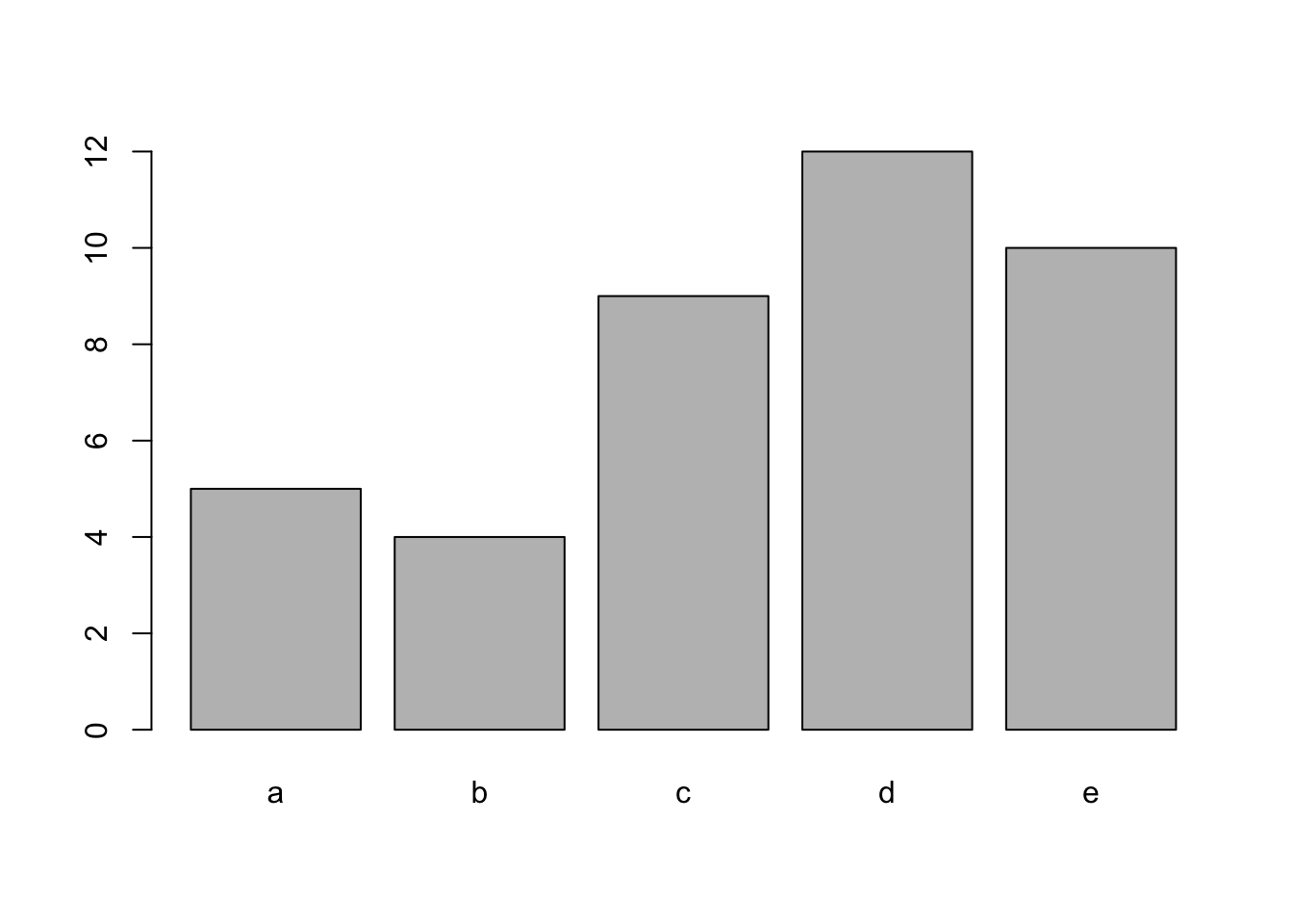
To create a bar chart in R, you can use the barplot() function from the base package. Here is an example of how to create a simple bar chart in R:
Code
# Load the base packagelibrary(base)# create dummy datadata <-data.frame(name=letters[1:5],value=sample(seq(4,12),5))# The most basic barplot you can do:barplot(height=data$value, names=data$name)
Click here to learn how to customize barplot() in R.
This will create a bar chart with a default x-axis ranging from 1 to the length of the data vector, and a y-axis ranging from the minimum to the maximum value in the data vector.
You can customize the appearance and layout of the chart by using various arguments in the barplot() function. For example, you can specify the names.arg argument to label the bars with custom names, or you can use the col argument to specify the color of the bars.
Here is an example of a more customized bar chart in R:
When to use a line graph
Line graphs are a good choice for displaying data that changes over time. They can be used to show trends, patterns, and relationships between different variables.
In kinesiology, line graphs might be used to show changes in physical variables over time, such as changes in muscle strength, flexibility, or cardiovascular fitness. Line graphs can also be used to show relationships between variables, such as the relationship between exercise intensity and energy expenditure.
When using a line graph in kinesiology, it is important to choose an appropriate time scale for the data being plotted. For example, if you are tracking changes in muscle strength over the course of a training program, you might use a line graph with weekly or monthly time intervals. On the other hand, if you are tracking changes in heart rate during a single exercise session, you might use a line graph with time intervals of seconds or minutes.
Overall, line graphs are a useful tool for visualizing data that changes over time, and can be a helpful way to track and analyze trends in kinesiology.
Line graphs in Excel
To create a line graph in Excel:
Open a new worksheet in Excel.
Enter the data that you want to include in the chart in the worksheet. Each row should contain a separate data series, and each column should contain a different data point within that series.
Select the data that you want to include in the chart. This should include the labels for the x-axis and the data for each series.
Click the “Insert” tab in the ribbon at the top of the screen.
In the “Charts” group, click the “Insert Line or Area Chart” button.
Select the type of line chart that you want to create (e.g. Line, Stacked Line, 100% Stacked Line).
The chart will be inserted into the worksheet. You can move and resize the chart as needed.
To customize the chart, right-click on the chart and select “Format Chart Area” from the context menu. This will open the Format Chart Area pane on the right side of the screen, where you can modify the appearance and layout of the chart.
To add or edit the data in the chart, click on the chart to activate it, then click on the data series or labels that you want to edit. You can also use the “Select Data” option in the “Data” group on the “Chart Tools” tab to edit the data and labels in the chart.
Line graphs in SPSS
To create a line graph in SPSS:
Open a new SPSS data file or open an existing data file that contains the data you want to use for the chart.
Click on the “Graphs” tab in the main SPSS window.
In the “Charts” group, click the “Chart Builder” button.
In the “Chart Builder” window, select the type of line chart that you want to create (e.g. Line, Stacked Line, 100% Stacked Line).
In the “Variables” box on the left side of the window, select the variables that you want to include in the chart. These will be the categories for the chart.
In the “Chart Preview” box on the right side of the window, you can see a preview of the chart as you build it. You can use the options in the “Chart Properties” and “Element Properties” boxes to customize the appearance and layout of the chart.
When you are satisfied with the chart, click the “OK” button to insert the chart into the output window.
To edit the data in the chart, click on the chart to activate it, then click the “Edit Data” button in the “Chart Tools” tab. This will open the “Edit Data” window, where you can modify the data and labels in the chart.
To save the chart, click the “Export” button in the “Chart Tools” tab, then select the “Save As” option and choose a location to save the chart. You can choose to save the chart as an image file (e.g. JPG, PNG) or as a SPSS chart template.
Line graphs in jamovi
To create a line graph in jamovi:
Open your dataset in jamovi by clicking on the bars in to upper left corner and then Open.
Under Analyses select Exploration > Descriptives.
In the Descriptives window, drag your variables to the Variables box.
Click on Plots > Line Plot.
Adjust the settings as needed.
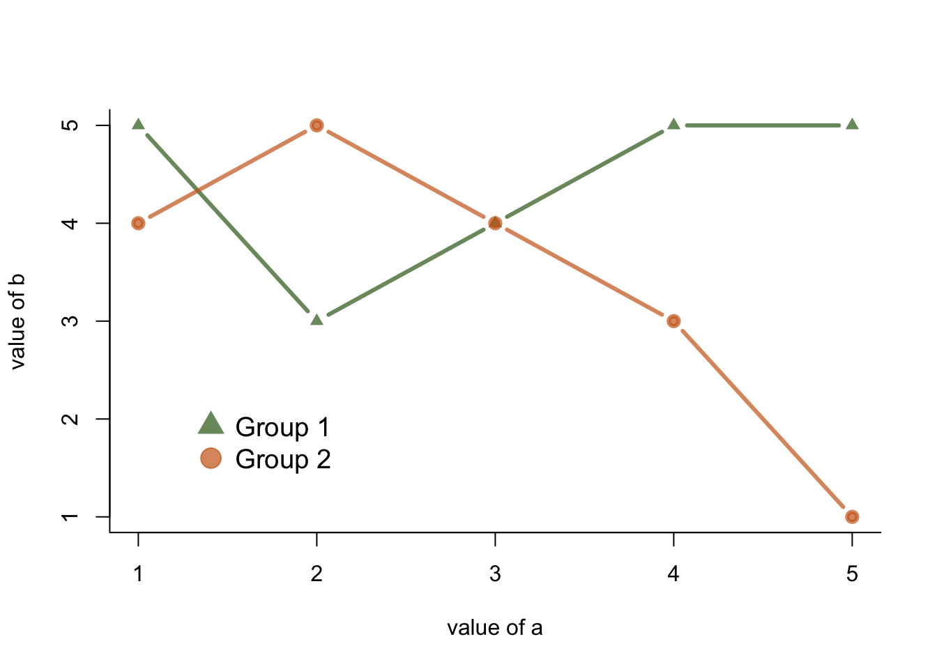
Line graphs in R
Code
# Create data:a=c(1:5)b=c(5,3,4,5,5)c=c(4,5,4,3,1)# Make a basic graphplot( b~a , type="b" , bty="l" , xlab="value of a" , ylab="value of b" , col=rgb(0.2,0.4,0.1,0.7) , lwd=3 , pch=17 , ylim=c(1,5) )lines(c ~a , col=rgb(0.8,0.4,0.1,0.7) , lwd=3 , pch=19 , type="b" )# Add a legendlegend("bottomleft", legend =c("Group 1", "Group 2"), col =c(rgb(0.2,0.4,0.1,0.7), rgb(0.8,0.4,0.1,0.7)), pch =c(17,19), bty ="n", pt.cex =2, cex =1.2, text.col ="black", horiz = F , inset =c(0.1, 0.1))
Scatter plots can be a useful data display option in kinesiology when you want to show the relationship between two variables. Some examples of when you might use a scatter plot in kinesiology include:
Showing the relationship between muscle strength and muscle size, or between muscle strength and age.
Plotting the results of tests that measure two different variables, such as the time it takes to complete a task and the distance covered during the task.
Showing the relationship between physical activity levels and health outcomes, such as the relationship between the amount of physical activity a person engages in and their risk of developing certain diseases.
In general, scatter plots are a good choice when you want to show the relationship between two variables, or when you want to see if there is a pattern or trend in the data. They can be particularly useful for identifying correlations or for detecting outliers in the data.
Scatter plots in Excel
To create a scatter plot in Excel:
Open a new worksheet in Excel.
Enter the data that you want to include in the chart in the worksheet. Each row should contain a separate data series, and each column should contain a different data point within that series.
Select the data that you want to include in the chart. This should include the labels for the x-axis and the data for each series.
Click the “Insert” tab in the ribbon at the top of the screen.
In the “Charts” group, click the “Insert Scatter (X, Y) or Bubble Chart” button.
Select the type of scatter plot that you want to create (e.g. Scatter, Bubble).
The chart will be inserted into the worksheet. You can move and resize the chart as needed.
To customize the chart, right-click on the chart and select “Format Chart Area” from the context menu. This will open the Format Chart Area pane on the right side of the screen, where you can modify the appearance and layout of the chart.
To add or edit the data in the chart, click on the chart to activate it, then click on the data series or labels that you want to edit. You can also use the “Select Data” option in the “Data” group on the “Chart Tools” tab to edit the data and labels in the chart.
Scatter plots in SPSS
Visit this link to watch a video on how to create a scatter plot in SPSS.
To create a scatter plot in SPSS:
Open a new SPSS data file or open an existing data file that contains the data you want to use for the chart.
Click on the “Graphs” tab in the main SPSS window.
In the “Charts” group, click the “Chart Builder” button.
In the “Chart Builder” window, select the type of scatter plot that you want to create (e.g. Scatter, Bubble).
In the “Variables” box on the left side of the window, select the variables that you want to include in the chart. These will be the categories for the chart.
In the “Chart Preview” box on the right side of the window, you can see a preview of the chart as you build it. You can use the options in the “Chart Properties” and “Element Properties” boxes to customize the appearance and layout of the chart.
When you are satisfied with the chart, click the “OK” button to insert the chart into the output window.
To edit the data in the chart, click on the chart to activate it, then click the “Edit Data” button in the “Chart Tools” tab. This will open the “Edit Data” window, where you can modify the data and labels in the chart.
Scatter plots in jamovi
Scatter plots in R
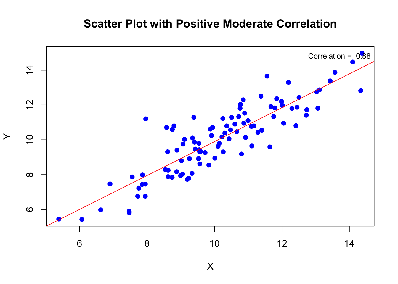
In the example below, we first generate some example data with a mean of 10 and a standard deviation of 2 for x, and a mean of 0 and a standard deviation of 1 for the error term added to y. Then, we calculate the correlation coefficient between x and y using the cor function.
Next, we create a scatter plot using the plot function, specifying the main title, x-axis label, y-axis label, point character (pch) and color (col). Finally, we add a legend to the top-right corner of the plot using the legend function, displaying the correlation coefficient with two decimal places. The bty parameter is set to “n” to remove the legend border, and the cex parameter is set to 0.8 to reduce the legend text size.
Code
# Generate some example dataset.seed(123)x <-rnorm(100, mean =10, sd =2)y <- x +rnorm(100, mean =0, sd =1)# Calculate correlation coefficient between x and ycorrelation <-cor(x, y)# Create scatter plot with title, labels and legendplot(x, y, main ="Scatter Plot with Positive Moderate Correlation",xlab ="X", ylab ="Y", pch =19, col ="blue")legend("topright", legend =paste("Correlation = ", round(correlation, 2)),bty ="n", cex =0.8)# Add best fit line to plotabline(lm(y ~ x), col ="red")
As expected, the association between raction time and bmi appears to be very week. In another post, I will show you how to use R to quantify the association between two variables.
When to use a box plot
A box plot, also known as a box and whisker plot, is a graphical display of data that shows the minimum, first quartile, median, third quartile, and maximum values within a dataset. It is often used to show the distribution of a dataset and to identify any outliers or unusual values.
In the field of kinesiology, a box plot could be used to display data on various measurements or characteristics, such as:
Physical performance or fitness levels
Biomechanical variables
Injury rates or severity
Rehabilitation outcomes
Quality of life or functional status
For example, a box plot could be used to compare the range of values for a particular measurement (e.g. muscle strength, flexibility, or mobility) between different groups of individuals (e.g. athletes, sedentary individuals, or patients with a particular condition). It could also be used to track changes in a measurement over time (e.g. before and after a training program or treatment).
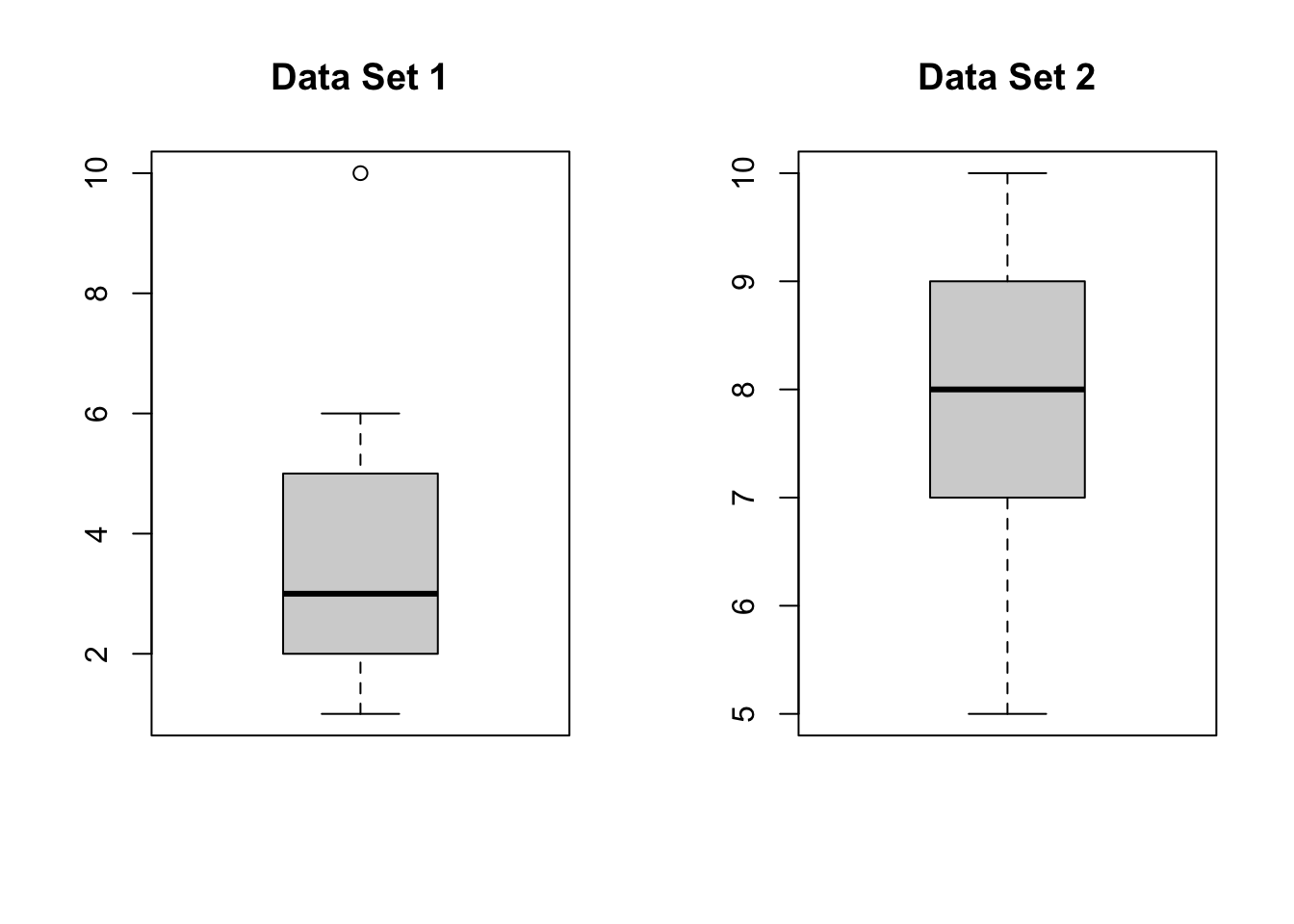
Box plots in R
Code
par(mfrow =c(1, 2))data1 <-c(2,3,2,1,4,2,3,5,6,10)data2 <-c(10,9,8,6,9,8,7,7,10,5)boxplot(data1, main ="Data Set 1")boxplot(data2, main ="Data Set 2")
Interpretation
Each of these box plots consists of a box and two whiskers. The box represents the first quartile, median, and third quartile of the data. The bottom of the box is the first quartile, the line in the middle of the box is the median, and the top of the box is the third quartile. The whiskers extend from the box to the minimum and maximum values. Any data points that are significantly lower or higher than the minimum and maximum values are represented by circles or other symbols and are called outliers.
Best practices for displaying data
Here are some best practices for displaying data:
Use an appropriate type of data display: Choose the type of data display that best suits the data you are presenting and the message you want to convey.
Use clear and accurate labels: Include a title and appropriate labels for each axis on your data display. Use accurate and consistent scales and units.
Emphasize key points: Use colors, markers, and other visual elements to highlight important trends and patterns in the data. Avoid using too many colors or visual elements, as this can make the data display cluttered and confusing.
Avoid distorting the data: Be careful not to distort the data by using an inappropriate scale or by omitting important data points.
Use accurate and appropriate data: Make sure to use accurate and relevant data in your data display. Be transparent about any limitations or sources of error in the data.
Use simple and clean design: Keep the design of your data display simple and clean. Avoid using overly complex or cluttered layouts.
Test your data display: Show your data display to others and ask for feedback. Make any necessary revisions to improve clarity and effectiveness.